Example of a Tree Map Using Multiple Levels and Advanced Formatting
A tree map shows hierarchical data as nested rectangles. The size of each rectangle is proportional to the measure of the data that it represents. Users can click a parent rectangle to drill through to the nest rectangles. Tree maps are a compact way of showing tree data and can help you see patterns in your data that are difficult to see in other ways.
This example shows a tree map for three levels of data: country, region, and city. The dialog shown in this example is used for TreeMap and OneParentTreeMap.
Creating a Tree Map
To create the report for the chart
- Create a new, blank report using the Sample DB data adapter and the query:
select * from orders order by shipcountry. - Click Next.
- Click
 to select all fields, then click Finish.
 - Delete all bands except for Title and Summary.
- Enlarge the Summary band to 500 pixels by changing the Height entry in the Band Properties view.
To create the chart
-
Click
 HTML5 Charts in the Components Pro section of the Palette. The cursor changes
  to show that an element is selected. Click and drag in the Summary band to size and place the chart.
The HTML5 Chart Edit Dialog is displayed.
-
Select your chart type. For this example, select TreeMap.
-
Click the Data Configuration tab.
The HTML5 Chart Edit Dialog is displayed.
-
Click
 next to Levels.
The Categories dialog opens.
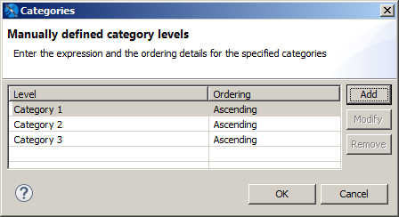
Figure 1 Defining Multiple Categories in a Chart -
Select Category 1 and click Modify.
The Expression Editor is displayed.
-
Enter your highest level of data for Category 1 then click Finish. For this example, enter:
$F{SHIPCOUNTRY}. -
Click Add in the Categories dialog, enter
$F{SHIPREGION}, and click Finish. -
Click Add in the Categories dialog, enter
$F{SHIPCITY}, and click Finish. -
When you have created all your levels, click OK to return to the HTML5 Chart Edit Dialog.
-
Enter the following to create the measure:
-
Value Expression:
$F{FREIGHT}.doubleValue()- Aggregation Function: Sum
- Tooltip Expression: "Total Freight"
-
Click OK, and save and preview the chart as HTML.
Using Advanced Formatting Properties
When you preview the chart as HTML, you can click a rectangle to zoom in. However, you can see some problems with the chart view.
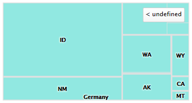 |
| Figure 2 Tree Map After Drill Through, Showing Formatting Issues |
-
When a country, such as the USA, is selected, the adjacent country is shown on the chart.
-
The label to return to a higher level reads undefined.
You can use advanced formatting to set these properties. For more information about advanced formatting, see 1.1, “Advanced Formatting of HTML5 Charts,” on page 1
To set advanced properties for the chart
-
Return to Design view and double-click the chart to open the HTML5 Chart Edit Dialog.
-
Click the Chart Formatting tab and click Show Advanced Properties.
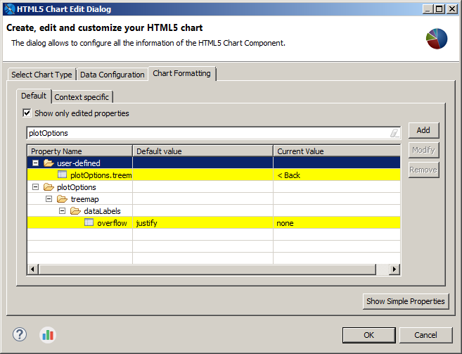
Figure 3 Advanced Formatting Properties -
Click Add.
-
The Chart Property dialog is displayed.
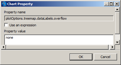
Figure 4 Setting Advanced Chart Formatting -
To prevent the names of other countries from showing on the border of the charts, enter the following, then click OK:
-
Property name:
plotOptions.treemap.dataLabels.overflow-
Property value:
none- To change the text of the button, click Add, enter the following, then click OK:
-
Property name:
plotOptions.treemap.drillUpButton.text -
Property value:
Back
-
-
Click OK to apply your properties and return to Design view.
Preview the chart in HTML to drill through and see your changes.
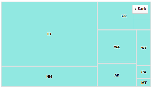 |
| Figure 5 Tree map after formatting issues have been corrected |
Note
Static Highcharts properties are always recognized as String. If you have problems setting a static Boolean or numeric property, set it as an expression. For example, to set plotOptions.series.dataLabels.enabled to false, use the following JRXML: