Example of a Time-Series Spline Chart
Time-series charts illustrate data points at successive time intervals and let you follow events over time. This example shows how to create a time-series spline chart.
Note
The following chart types use a similar interface: TimeSeriesLine, TimeSeriesSpline, TimeSeriesArea, TimeSeriesAreaSpline.
To create the report for the chart
- Create a new, blank report using the Sample DB data adapter and the query:
select * from orders. - Click Next.
- Click
 to select all the fields, then click Finish.
 - Delete all bands except for Title and Summary.
- Enlarge the Summary band to 500 pixels by changing the Height entry in the Band Properties view.
To create the chart
-
Click
 HTML5 Charts on the Components Pro section of the Palette. The cursor changes
  to an element is selected. Drag to fill the Summary band of your report.
The HTML5 Chart Edit Dialog is displayed.
-
Select TimeSeriesSpline for your chart type.
-
Click the Data Configuration tab.
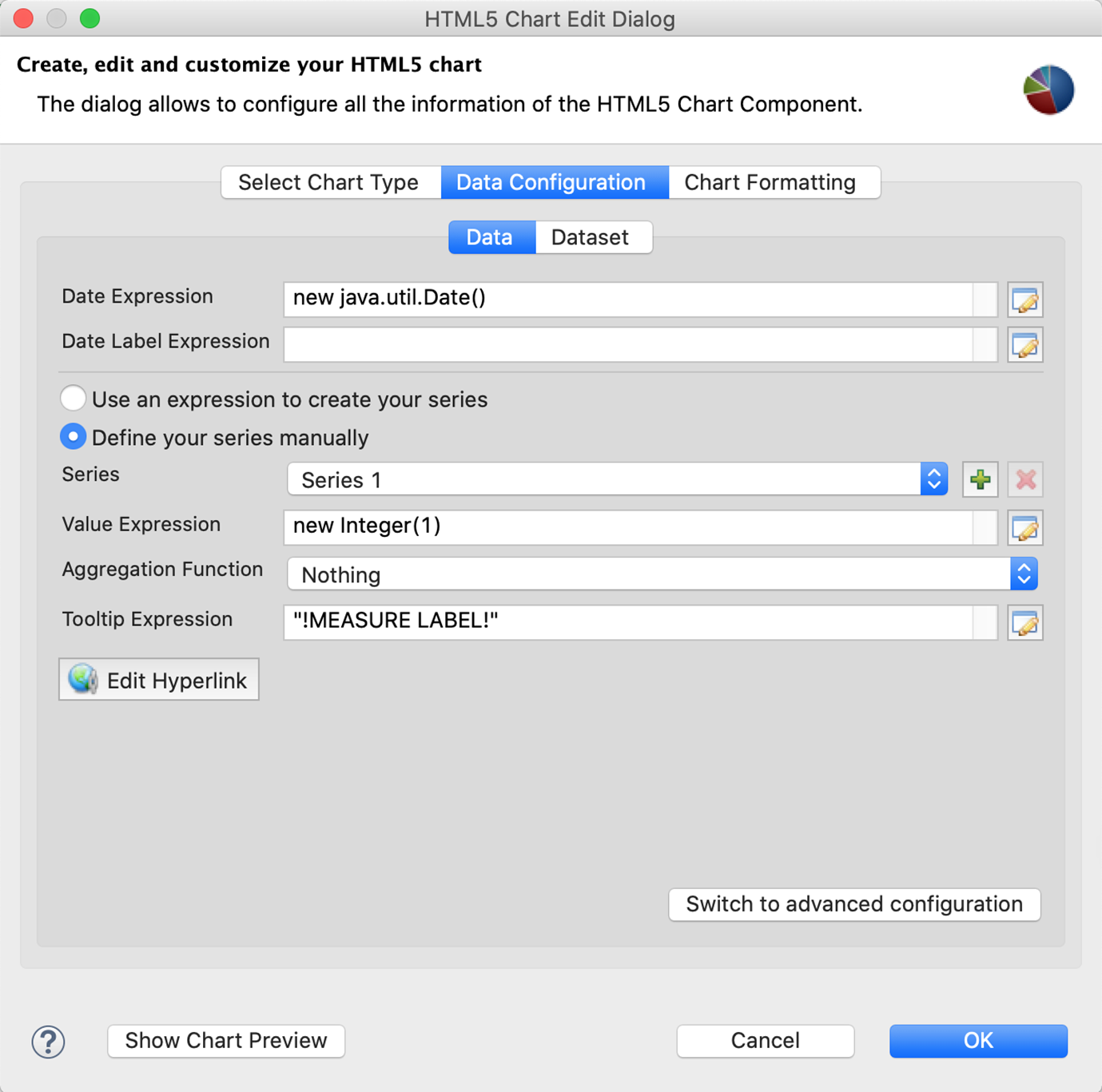
Figure 1 Simple data configuration view for time-series charts -
Enter an expression for the date in the Date Expression field. You can click
 to use the expression editor or enter the expression manually. For this example, enter:
$F{ORDERDATE}. -
To use multiple series, select Define your series manually.
-
Define your first series. For this example, use the following data:
-
Series: Series 1. The name of the series is automatically generated. You cannot change it in a simple configuration.
-
Value Expression:
$F{FREIGHT}. -
Aggregation Function: Highest
-
Tooltip Expression: "max freight"
- To define an additional series, click
 . For this example, define a second measure using the following data.
- To define an additional series, click
-
Series: Series 2.
-
Value Expression:
$F{FREIGHT}.multiply(new BigDecimal(0.5)) -
Aggregation Function: Sum
-
Tooltip Expression: "total freight/2"
-
-
Click OK to close the HTML5 Chart Edit Dialog.
- Preview the report.
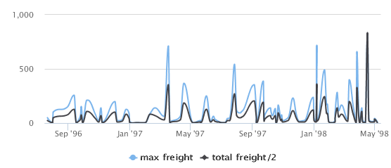 |
| Figure 2 Time series spline chart |