Example of a Column-Spline Chart
This example shows how to create a column-spline chart that plots average freight and total orders per country. It then shows how to switch to advanced configuration, edit your chart, and add a series.
A similar dialog is used for the following types of charts:
-
Dual- and multi-axis charts that use different scales for each y-axis. (This enables you to compare data items easily with very different scales.)
-
Combination charts that display multiple data series in a single chart that combines the features of two different charts.
Note
The following chart types use this dialog: ColumnLine, ColumnSpline, StackedColumnLine, StackedColumnSpline, MultiAxisLine, MultiAxisSpline, MultiAxisColumn.
Creating the Chart Using Simple Configuration
To create the report for the chart
-
Create a new, blank report using the Sample DB data adapter and the following query:
select * from orders where shipcountry = 'GERMANY'Click Next.
-
Click
 to select all the fields. Click Finish.
 -
Delete all bands except for Title and Summary.
-
Enlarge the Summary band to 500 pixels by changing the Height entry in the Band Properties view.
To create the chart using a simple configuration
-
Click
 HTML5 Charts in the Components Pro section of the Palette. The cursor changes
  to show that an element is selected. Click and drag in the Summary band to size and place the chart.
 -
In the HTML5 Chart Edit Dialog, select ColumnSpline. If you are prompted to confirm, click Yes.
-
Click the Data Configuration tab.
The HTML5 Chart Edit Dialog is displayed.
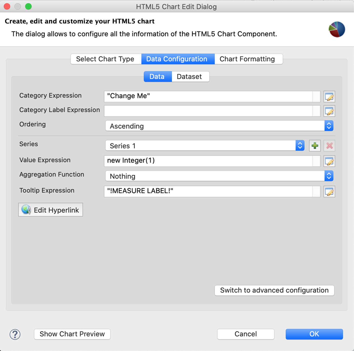
Figure 1 Simple Configuration for Column-Spline Chart -
Enter the following to create your category:
-
Category Expression:
$F{SHIPCOUNTRY}-
Ordering: Ascending
- Select Series 1 and configure the first measure for total freight. This measure is used for columns. You can change this using advanced configuration:
-
Value Expression:
$F{FREIGHT} -
Aggregation Function:
Average -
Tooltip Expression:
"Average Freight"- Select Series 2 from the drop-down and configure the second measure for total orders. This measure is used for spline:
-
Value Expression:
$F{ORDERID} -
Aggregation Function:
DistinctCount -
Tooltip Expression:
"Total Orders"
-
-
Click OK to return to design view.
- Save and preview your report. It should look like the following figure.
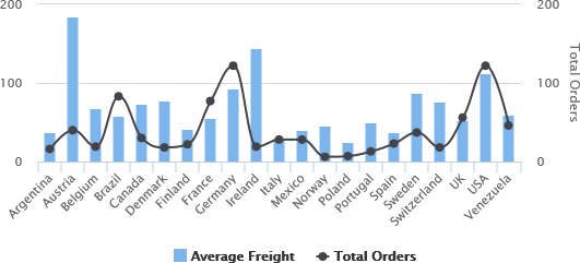 |
| Figure 2 Column Spline Chart |
Using Advanced Configuration
You can use advanced configuration to modify your measures and to add a series level.
To use advanced configuration to edit measures
A simple configuration lets you add a measure, but does not let you choose set whether the measure is used for columns or spline. To change this setting, use advanced configuration to set the series property type (column, line, or spline).
-
From the design view, double-click the chart to open the HTML5 Chart Edit Dialog.
-
Click Switch to advanced configuration.
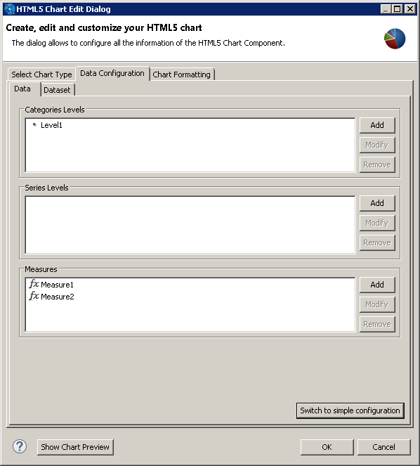
Figure 3 Advanced Configuration for a Chart -
Select Measure1 and click Modify.
The Measure dialog is displayed. The dialog contains the settings generated when you created the measure in a simple configuration, although some of the settings have different names. If you want, you can use this dialog to change the name to Average Freight.
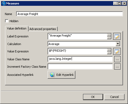
Figure 4 Editing a Measure -
Click the Advanced Properties tab.
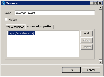
Figure 5 Advanced Properties for a Measure in a Column-Spline Chart -
Click Add to specify the series type:
-
Contributor:
SeriesProperty-
Property Name:
type -
Use Constant Value:
splineClick OK, then click OK again.
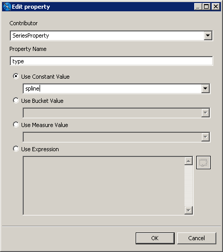
Figure 6 Adding a Series Property Note
The supported constant values for series property type are
column,line, andspline.-
Select Measure2 and click Modify.
The Measure dialog is displayed. If you want, you can change the name to Total Orders.
-
Click the Advanced Properties tab.
-
Click Add to specify the series type:
-
-
Contributor:
SeriesProperty -
Property Name:
type -
Use Constant Value:
columnClick OK, then click OK again.
- Click OK thrice to return to the design view, then save and preview the chart. The display has changed to reflect your settings.
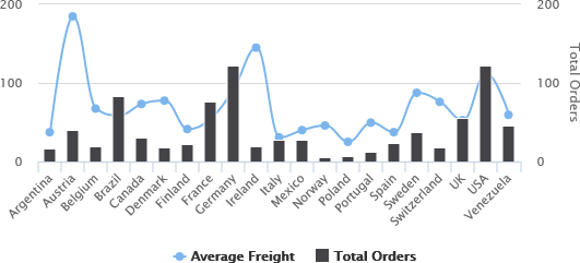
Figure 7 Chart After Changing the Measure Types To add a series level
-
From the design view, double-click the chart to open the HTML5 Chart Edit Dialog.
-
Make sure you are in the advanced configuration view of the Data Configuration tab.
-
Set the series type for any existing measures, as described above.
-
Click Add in the Series Level section to open the Series Level dialog.
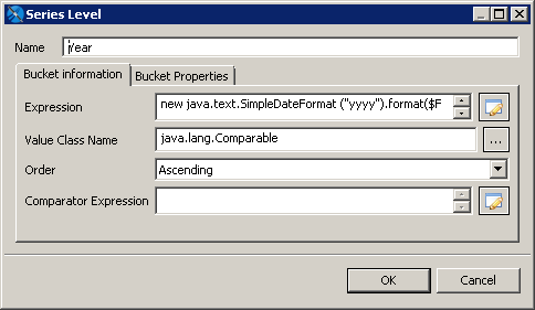
Figure 8 Adding a Series Level to a Column-Spline Chart -
Create a series with the following:
-
Name:
Year -
Expression:
new java.text.SimpleDateFormat ("yyyy").format($F{ORDERDATE}) -
Value Class Name:
java.lang.Comparable -
Order:
Ascending
-
Click OK twice to return to design view.
- Save and preview the report.
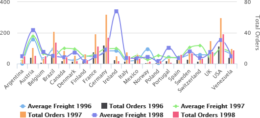 |
| Figure 9 Adding a Series Level to a Column-Spline Chart |