The Visualization Selector
The Visualization Selector lets you switch between Ad Hoc view types, allowing you to choose the best way to represent your information in the Ad Hoc view, including:
-
Table, which displays values corresponding to the rows and columns in the data source.
-
Crosstab, which compares one or more values across multiple sets of related fields.
-
Column, which compares values displayed as columns.
-
Bar, which compares values displayed as bars.
-
Line, which compares values displayed as points connected by lines.
-
Area, which compares values displayed as shaded areas.
-
Spider, which compares three or more values on a series of spokes. Spider charts can use columns, lines, or areas to display values.
-
Dual- and Multi-Axis, which display values using two or more measures.
-
Time Series, which compares time intervals displayed as points connected by lines. The Time Series chart type is only available for non-OLAP charts.
-
Scatter, which compares values as individual points arrayed across both axes of a chart.
-
Bubble, which compares three measures displayed as circles of varying sizes arrayed across both axes of a chart.
-
Pie, which compares values displayed as slices of a circular graph.
-
Range, which displays values such as heat and tree maps. Only the Heat Map chart is available for OLAP data sources.
-
Gauge, which displays values as a radial or arc gauge, based on a defined minimum and maximum measure setting.
Note
JasperReports Server has limited support for scatter charts created in some older versions. You can use the Ad Hoc views for those scatter charts to generate new reports, but you cannot edit them
To select a new visualization type
-
In the Ad Hoc Editor tool bar, click the
 icon to display the Select Visualization Type window.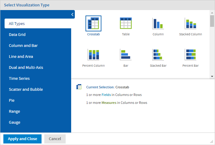
Figure 1 Select Visualization Type Window, for Old Layout Band
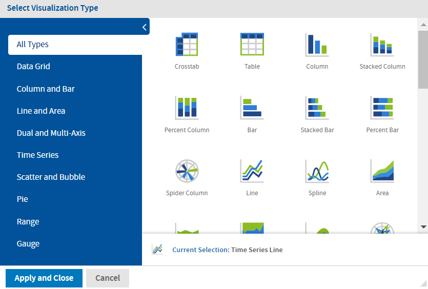
Figure 2 Select Visualization Type Window, for New Layout Band
-
Click the type of visualization that you want to apply to your report. The selected visualization type is outlined in blue. The Visualization Selector displays a description of the selected visualization and the number of fields and measures that it uses.
-
Click Apply and Close to use the visualization type.
The following table describes the available visualization types, and the rules (if any) affecting their use:
HTML5 Visualization Types
Icon |
Description |
|---|---|
Data Grid |
Data grids display values from the data source in columns and rows as either individual or aggregate values. |
 |
Crosstab - Compares one or more measures across multiple sets of related fields. For both Old and New Layout Band:
|
 |
Table - Displays values corresponding to the columns and rows in the data source. For both Old and New Layout Band:
|
Column and Bar |
Column charts compare values displayed as columns and bars. |
|
Column - Multiple measures of a group are depicted as individual columns. For Old Layout Band:
For New Layout Band:
The drop areas are same for Stacked Column, and Percent Column. |
|
Stacked Column - Multiple measures of a group are depicted as portions of a single column whose size reflects the aggregate value of the group. |
|
Percent Column - Multiple measures of a group are depicted as portions of a single column of fixed size. |
|
Spider Column - Multiple measures of a group are depicted as portions of individual "columns" along a spoked chart. For Old Layout Band:
For New Layout Band:
|
|
Bar - Multiple measures of a group are depicted as individual bars. For Old Layout Band:
For New Layout Band:
The drop areas are same for Stacked Bar, and Percent Bar. |
|
Stacked Bar - Multiple measures of a group are depicted as portions of a single bar whose size reflects the aggregate value of the group. |
|
Percent Bar - Multiple measures of a group are depicted as portions of a single bar of fixed size. |
Line and Area |
Line charts compare values displayed as points connected by lines. |
|
Line - Displays data points connected with straight lines. For Old Layout Band:
For New Layout Band:
|
|
Spline - Displays data points connected with a fitted curve. For Old and New Layout Band the drop areas are same as the Line chart. |
|
Spider Line - Displays data points connected with straight lines on a spoked chart. For Old Layout Band:
For New Layout Band:
|
|
Area - Displays data points connected with a straight line and a color below the line. Groups are displayed as transparent overlays. For Old Layout Band:
For New Layout Band:
The drop areas are same for Stacked Area, Percent Area, and Area spline. |
|
Stacked Area - Displays data points connected with a straight line and a solid color below the line. Groups are displayed as solid areas arranged vertically, one on top of another. |
|
Percent Area - Displays data points connected with a straight line and a solid color below the line. Groups are displayed as portions of an area of fixed size, and arranged vertically one on top of another. |
|
Area Spline - Displays data points connected with a fitted curve and a color below the line. Groups are displayed as transparent overlays. |
|
Spider Area - Displays data points connected with straight lines and a solid color between the line and the center of a spoked chart. Groups are displayed as transparent overlays. For Old Layout Band:
For New Layout Band:
|
Dual and Multi-Axis |
Dual and multi-axis charts compare two or more measures, using multiple charting types or multiple axes. |
|
Column Line - Displays leftmost measures as columns, last measure as a line. For Old Layout Band:
|
|
Stacked Column Line - Displays leftmost measures as stacked bars, last measure as a line. For Old Layout Band:
For New Layout Band the drop areas are same as Column Line chart. |
|
Column Spline - Displays leftmost measures as columns, last measure as a spline. For Old Layout Band:
For New Layout Band the drop areas are same as Column Line chart. |
|
Stacked Column Spline - Displays leftmost measures as stacked columns, last measure as a line.
For New Layout Band the drop areas are same as Column Line chart. |
|
Multi-Axis Line - Displays each measure as a separate axis line. For Old Layout Band:
|
|
Multi-Axis Spline - Displays each measure as a separate axis spline. For Old Layout Band:
For New Layout Band the drop areas are same as Multi-Axis Line chart. |
|
Multi-Axis Column - Displays each measure as a separate axis column. For Old Layout Band:
|
Time Series |
Time Series charts illustrate data points at successive time intervals.
**Note** Set the grouping option for the time or date field to “Day” or smaller interval. |
|
Line - Displays date and time data points connected with straight lines. For Old Layout Band:
|
|
Spline - Displays date and time data points connected with a fitted curve. For Old Layout Band:
For New Layout Band the drop areas are same as Time Series Line. |
|
Area - Displays date and time data points connected with a straight line and a color below the line. Groups are displayed as transparent overlays. For Old Layout Band:
|
|
Area Spline - Displays date and time data points connected with a fitted curve and a color below the line. Groups are displayed as transparent overlays. For Old Layout Band:
|
Scatter |
Shows the correlation between two or three measures. |
|
Scatter - Displays first measure as the x-axis, the second measure as the y-axis. Other fields and dimensions in the column group become data points. For old Layout Band:
|
 |
Bubble - Displays the first measure as the x-axis, the second measure as the y-axis, and the third measure determines the size of the disk. For Old Layout Band:
|
Pie |
Pie charts display values as slices of a circular graph. |
|
Pie - Multiple measures of a group are displayed as sectors of a circle. For Old Layout Band:
For New Layout Band:
|
|
Dual Pie - Multiple measures of a group are displayed as sectors of concentric circles. For Old Layout Band:
|
 |
Semi-Pie - Multiple measures of a group are displayed as sectors of a half-circle. For Old Layout Band:
For New Layout Band:
|
Range |
Range charts display values as heat maps. |
 |
Heat Map - Individual values are represented as colors. For old Layout Band: Non-OLAP:
|
 |
Time Series Heat Map - Individual values across dates/times represented as colors. For Old Layout Band:
|
 |
Dual Measure Tree Map - Displays data as color-coded rectangles. The size of each rectangle is proportional to the first measure and the color represents the second measure.
|
 |
Tree Map - Displays data as rectangles. The size of each rectangle is proportional to the measure of the data that it represents. The tree map displays nested rectangles when you have more than one field. The parent rectangle represents the leftmost measure while the nested rectangles represent the current level of aggregation. Click a parent rectangle to drill down to the nest rectangles. For Old Layout Band:
|
 |
Parent Tree Map - Displays data as nested rectangles. The size of each rectangle is proportional to the measure of the data that it represents. The nested rectangles represent the current level of aggregation while the larger rectangle represents the parent level in the hierarchy. Click a parent rectangle to drill down to the nest rectangles. For Old Layout Band:
|
Gauges |
Gauges display values as a portion of a radial or arc gauge. |
 |
Gauge - Displays a single data value as a portion of a circle. The length of the circle is the data's numeric value proportional to the maximum size defined for the measure. For Old Layout Band:
|
 |
Multi-level Gauge - Displays one or more data values as concentric circles. Each circle represents a measure and the length of the circle is the data's numeric value proportional to the maximum size defined for the measures.
|
 |
Arc Gauge - Displays a single data value as a portion of a semi-circular arc. The length of the arc is the data's value proportional to the maximum size defined for the measure. For Old Layout Band:
|


