Report Designer
JasperReports Web Studio's main feature is the editor for JRXML report templates. Like Jaspersoft Studio, the editor has three tabs:
-
Visual report designer
-
Query designer
-
JRXML source editor
-
Report preview
You can switch between these tabs using buttons at the upper-right corner of the application window.
Visual Report Designer
The visual report designer consists of a Designing Area, Outline, Palette, and Properties panel.
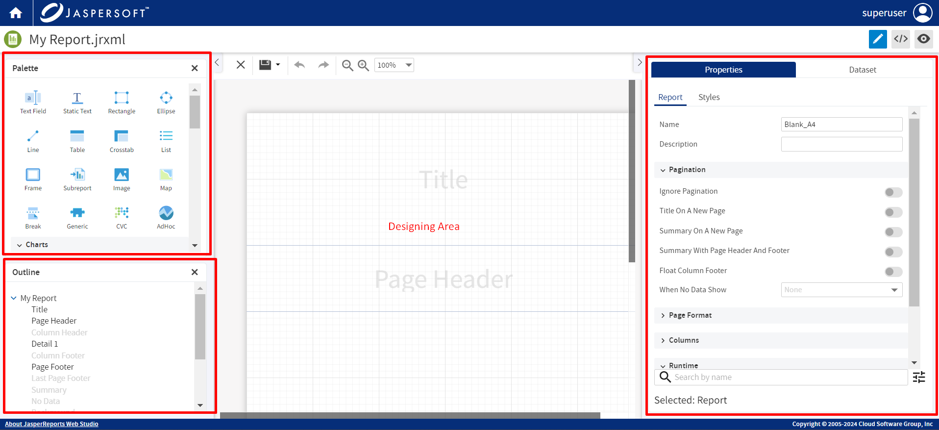
The Palette contains all the elements from which the report is built. Drag an element from the Palette into the designer.
The Outline shows the structure of the layout part of the report. You can view, add, and delete the bands from here. You can also view the order of the elements in a container.
The Designing Area shows the large layout composed of the bands and elements. Drag the elements to arrange them in the desired layout. Keep in mind that this is very close to the report rendered in the HTML format. Reports rendered in PDF or other formats may look a bit different.
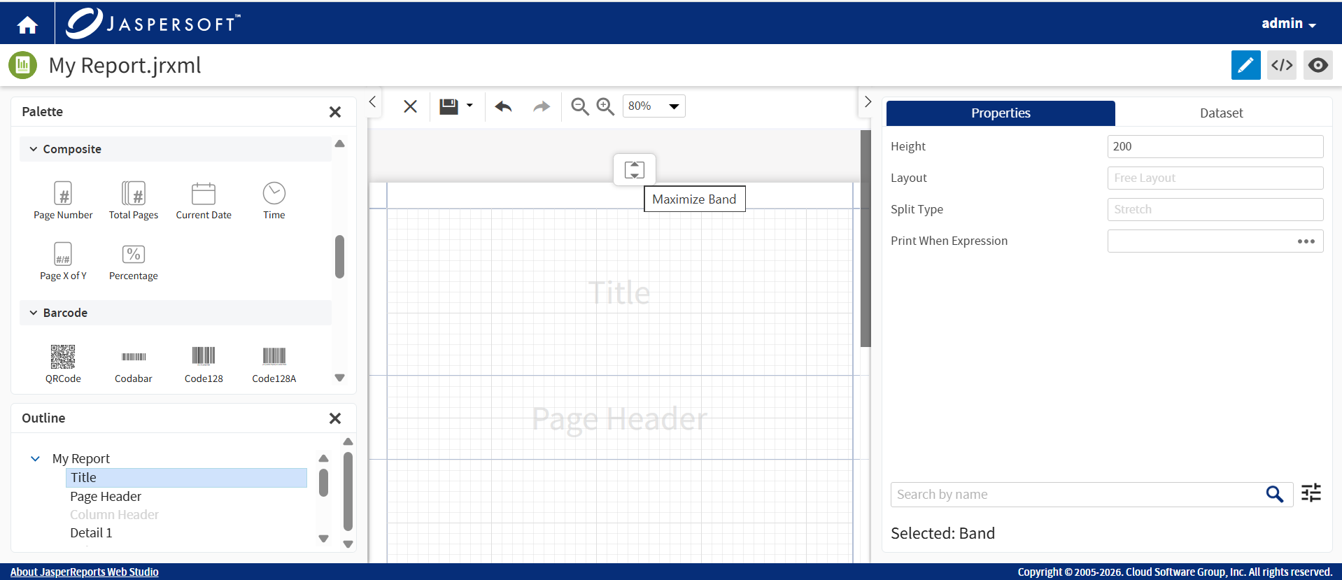
When you select any band, an option to maximize the band is displayed. Clicking the Maximize Band button triggers the container to expand to its maximum available height.
Selecting an element in the Outline or Designing Area automatically shows its properties in the Properties panel. Elements could have hundreds of properties that are organized in categories. It is possible to filter properties by name by using the search box at the bottom of the view. In the same place, there is an icon to set more filters, to show or not deprecated properties, or all JasperReports custom properties.
A special category of properties is styles. If an element uses a style, properties inherit the value of the parent style. These values are shown in the light gray color. In general, if the property shows the value in the light gray color, this is the default or calculated from the properties value, black color is used for the actual value.
Snap to Geometry
You can use this feature to align various elements in the Designing Area. When moving and resizing an element, a magnetic effect helps an element to align with the band borders and the location and size of other elements. When multiple elements are selected, the magnetic effect works on the whole bounding box that contains the selected elements.
Context Menu
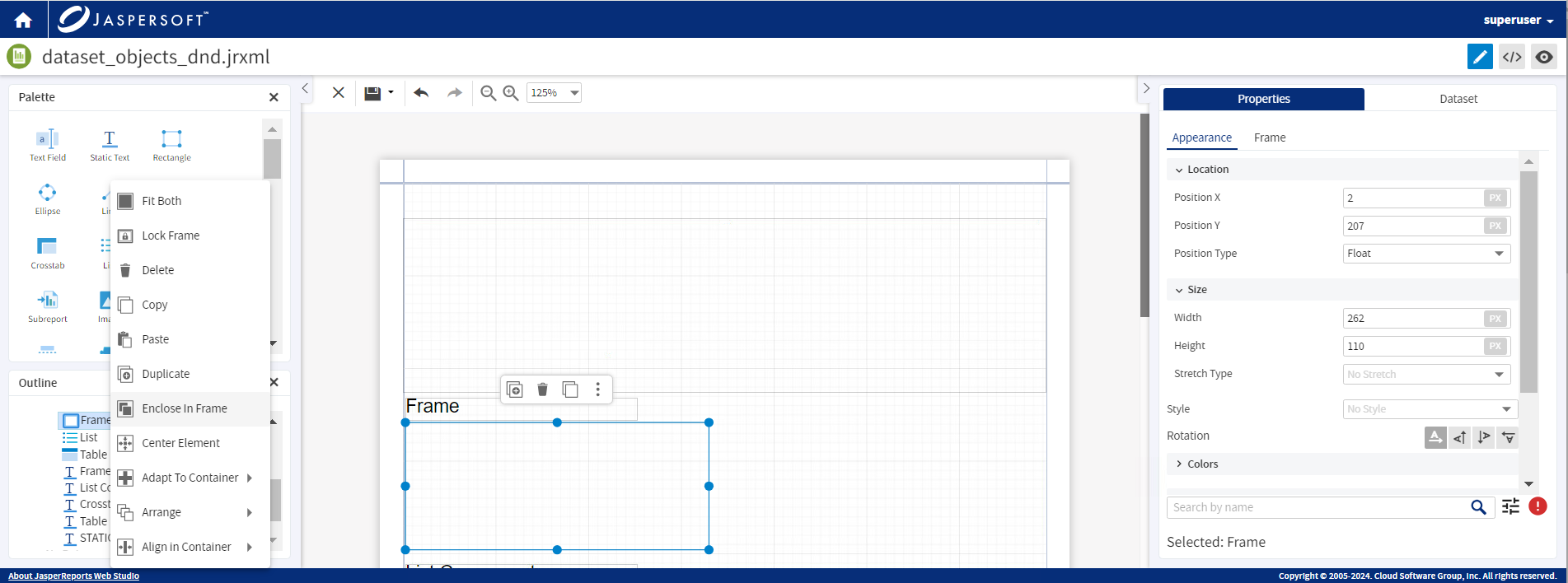
Use the context menu from the Outline to align and resize the elements in the Designing Area. Right-click on an element to use any of the following options:
-
Fit Both: Fits the element within the container in the Designing Area.
-
Delete: Deletes the element.
-
Copy: Copies the element.
-
Paste: Pastes the element.
-
Duplicate: Creates a copy of the element.
-
Enclose in Frame: Encloses the elements in a frame. Set properties for the frame to apply them to all the elements within the frame at the same time.
-
If you select an element within a frame, a new option
 to select all the elements in the frame is available.
 -
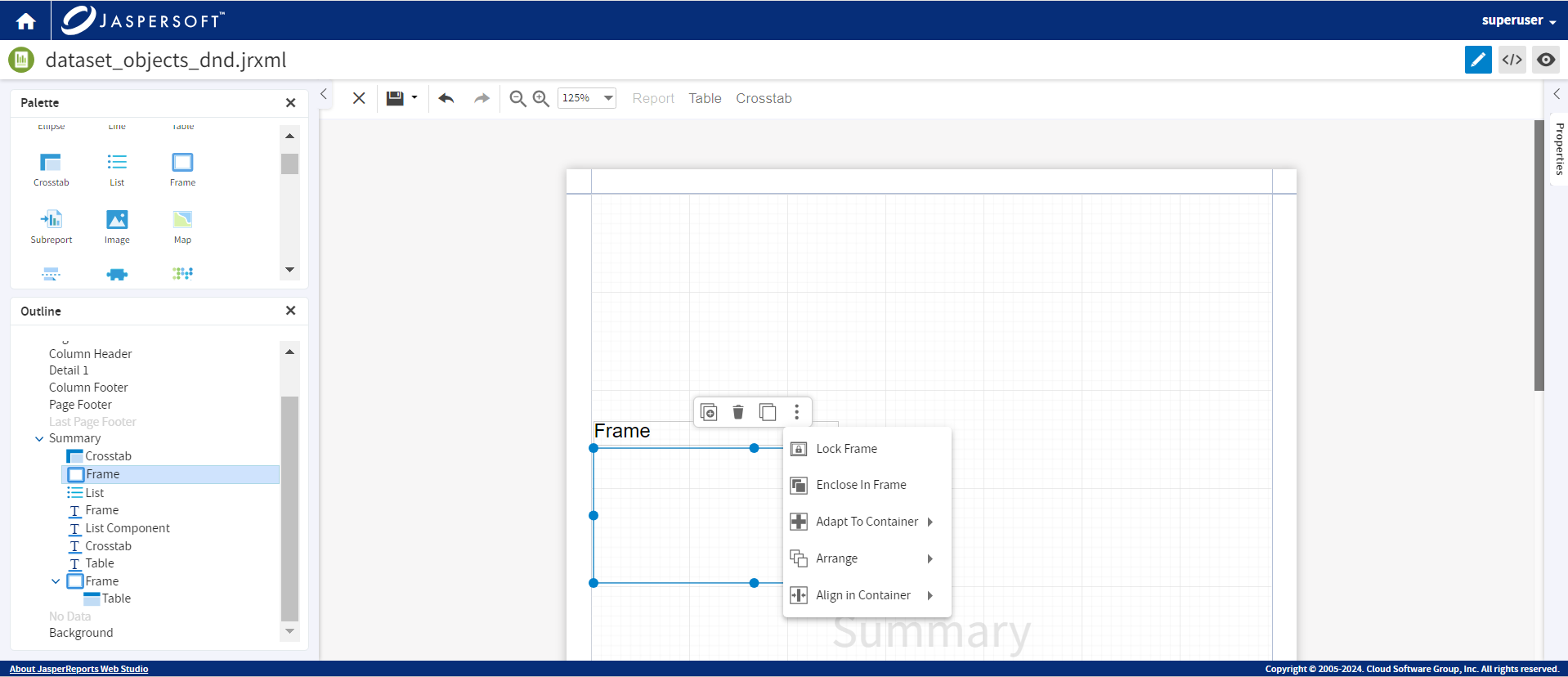
Only when a frame is selected, the Lock Frame option is displayed. This action locks the elements in the frame. The elements cannot be selected or dragged and dropped. You can Unlock Frame to perform the actions as required.
-
-
Center Element: Aligns the element to the center.
-
Adapt to Container: Aligns the element to Fit Width, Fit Height, or Fit Both (width and height), within the container in which it is placed.
-
Arrange: Arranges the element To Back, To Front, Backward, or Forward.
-
Align in Container: Aligns the element within the container.
Whenever you select an element from Outline, the context menu actions that you see for the elements are also available in the horizontal mini toolbar. The mini toolbar is displayed when you click an element. It provides the option to duplicate, delete, copy, and when you click the ellipses, a list of sub-menu options are shown.
Images
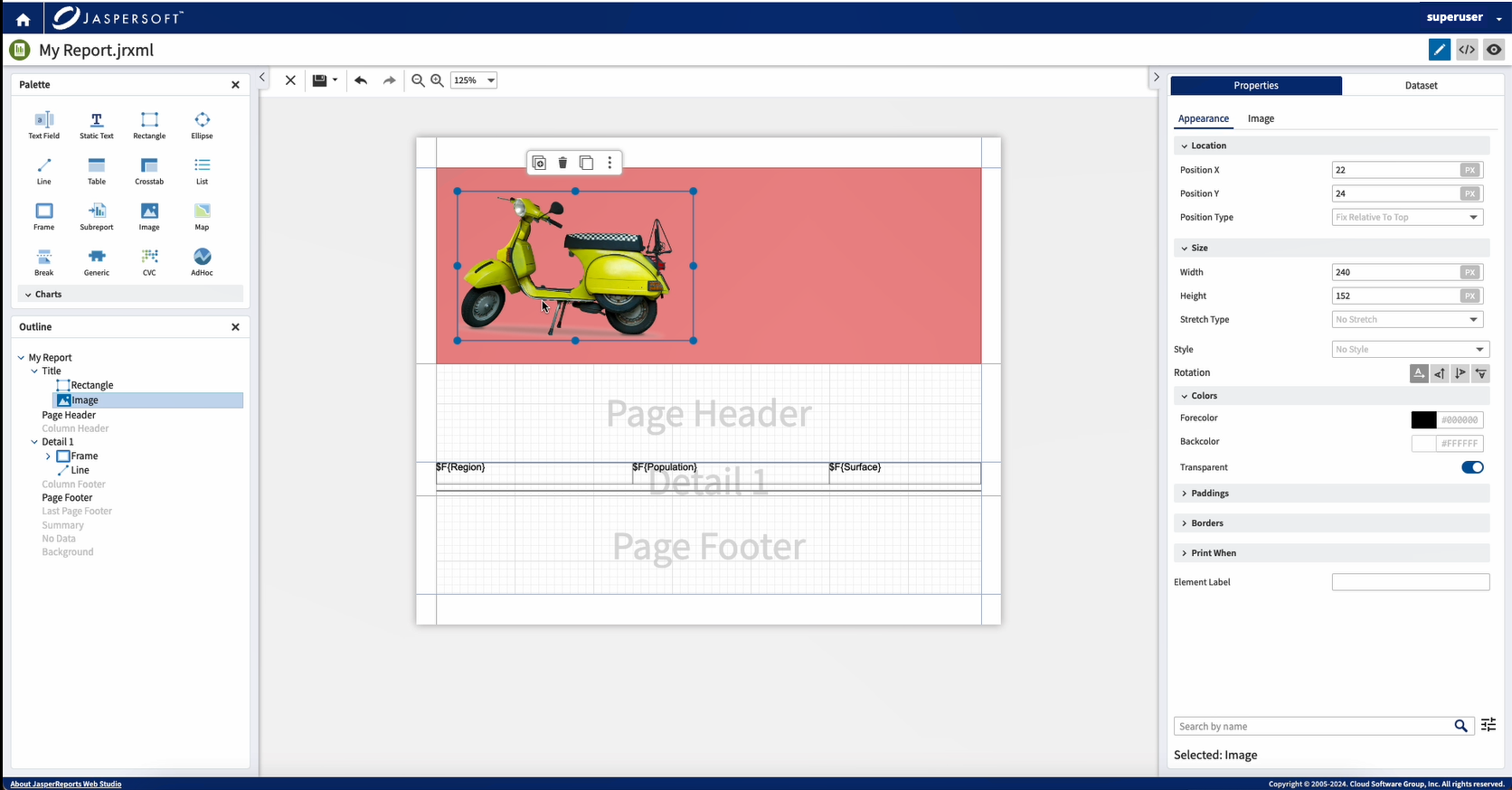
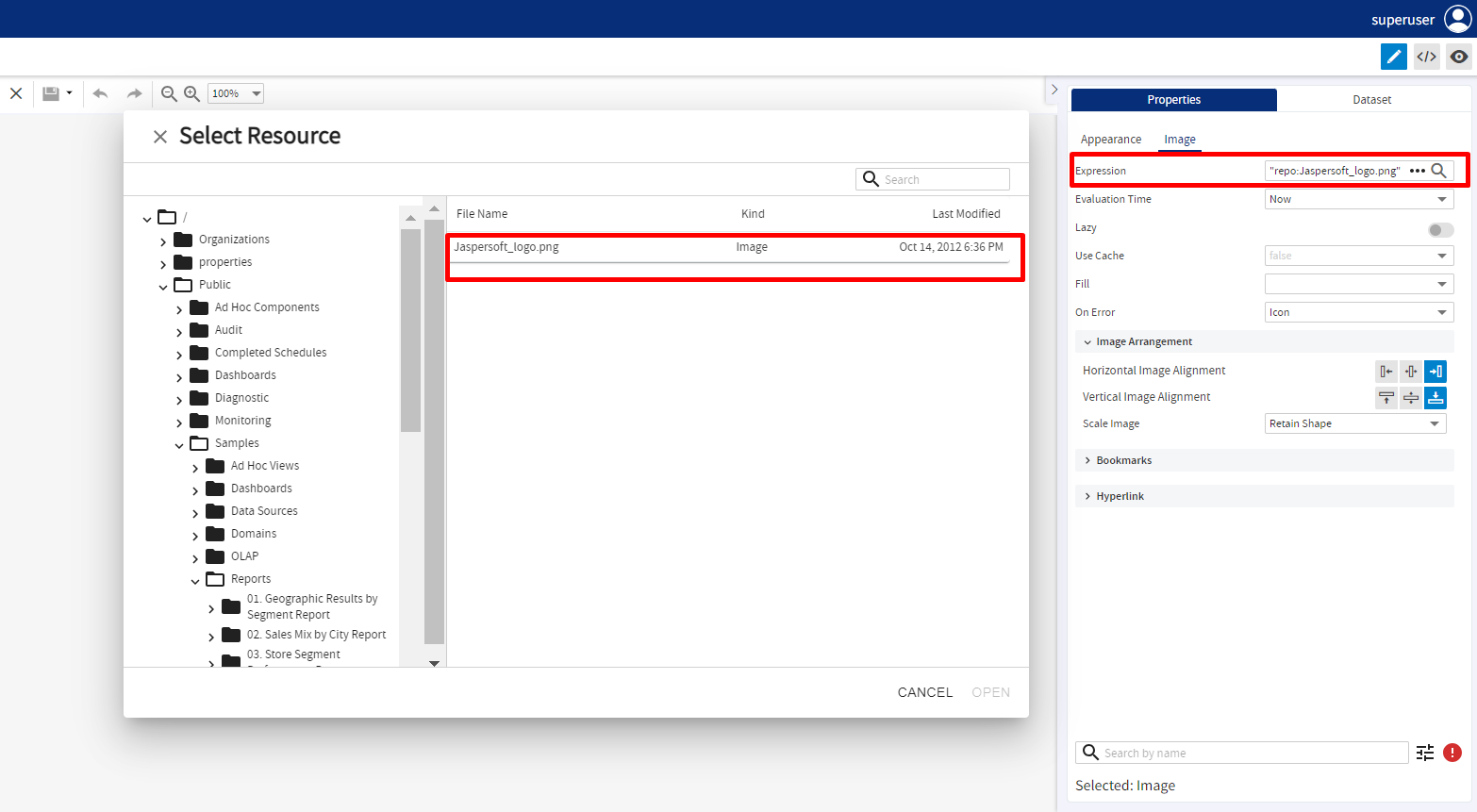
This feature enables you to add an image to the report with ease. Drag the Image element from the Palette to the desired location on the report page.
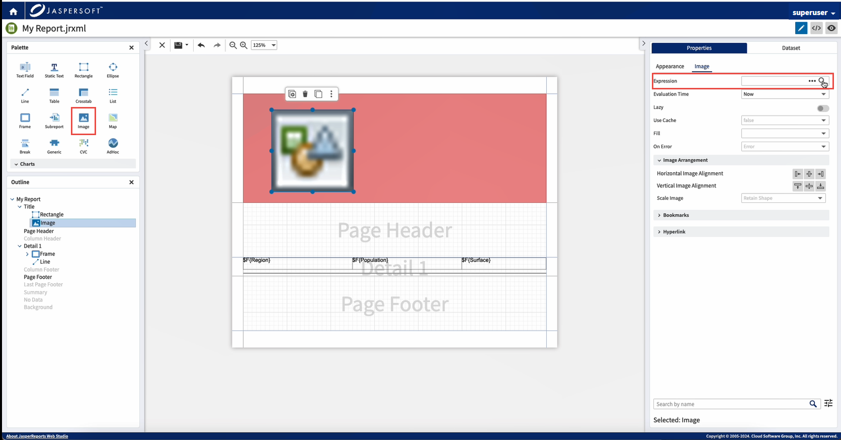
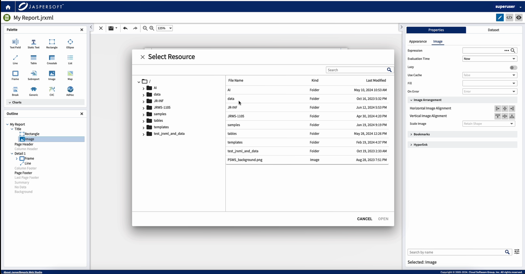
Click the Search icon in Expression to select an image. If it is a simple image, it is displayed in the designer.
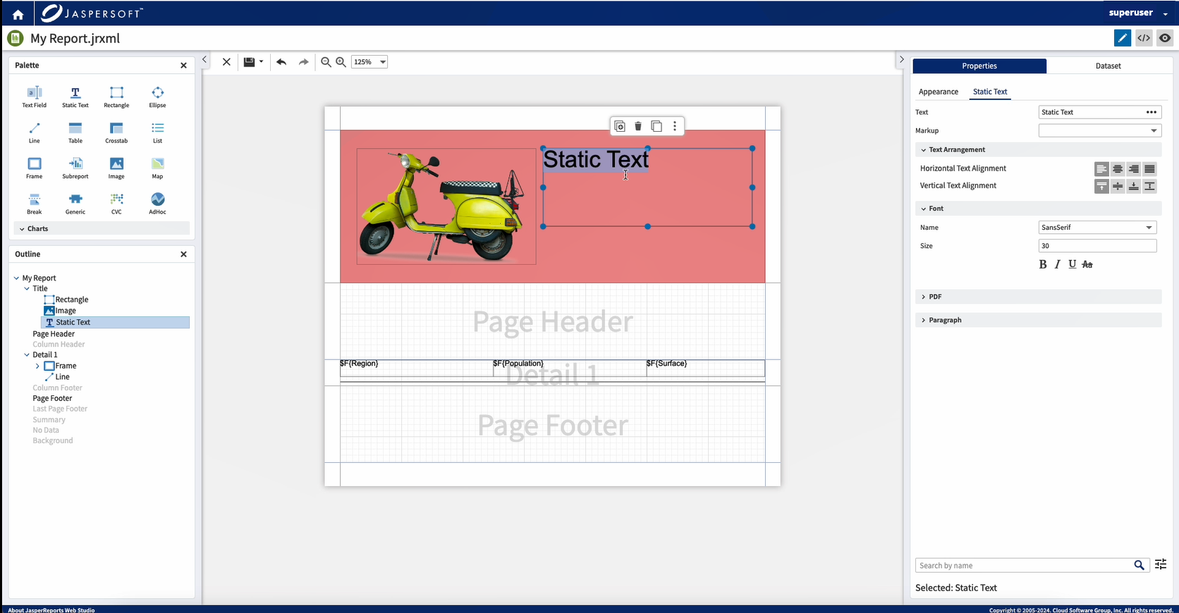
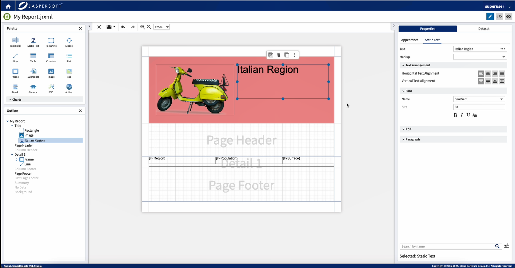
Edit a text element or expression inline. Double-click a Text Field or Static Text element to change the expression and text quickly. Use the Properties panel to change element properties, such as Color or Font.
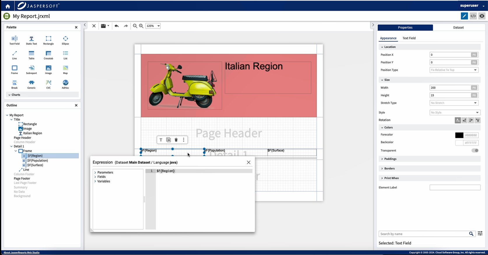
You can also edit expressions inline. Double-click an expression, and in the Expression editor, edit the expression inline.
Composite
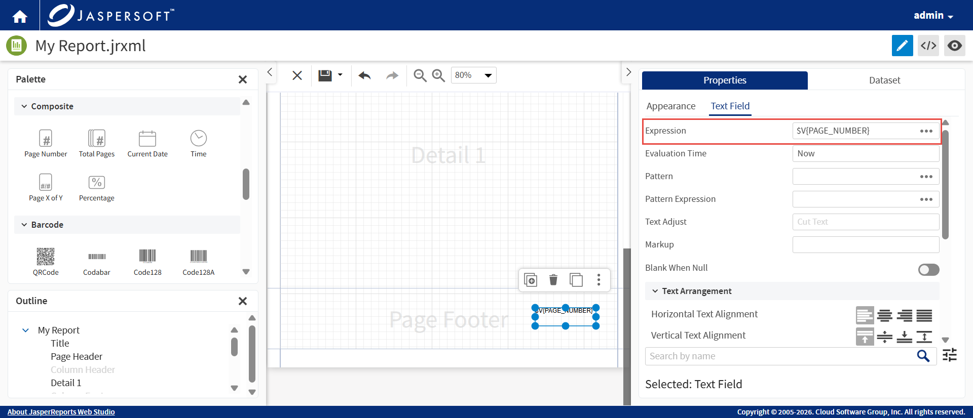
This feature enables you to add a composite element to the report with ease. A Composite element is a Text Field preconfigured with specific expressions, such as percentages, page numbering (current and total), and dynamic timestamps.
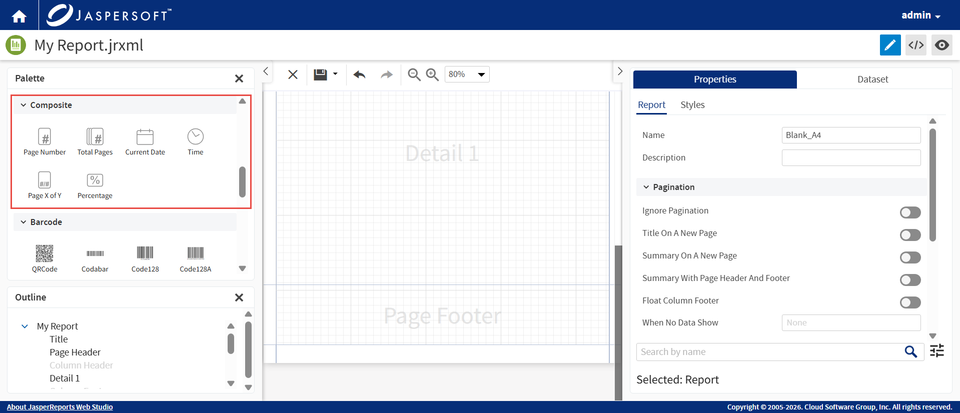
Drag a Composite element from the Palette to the desired location on the report page.
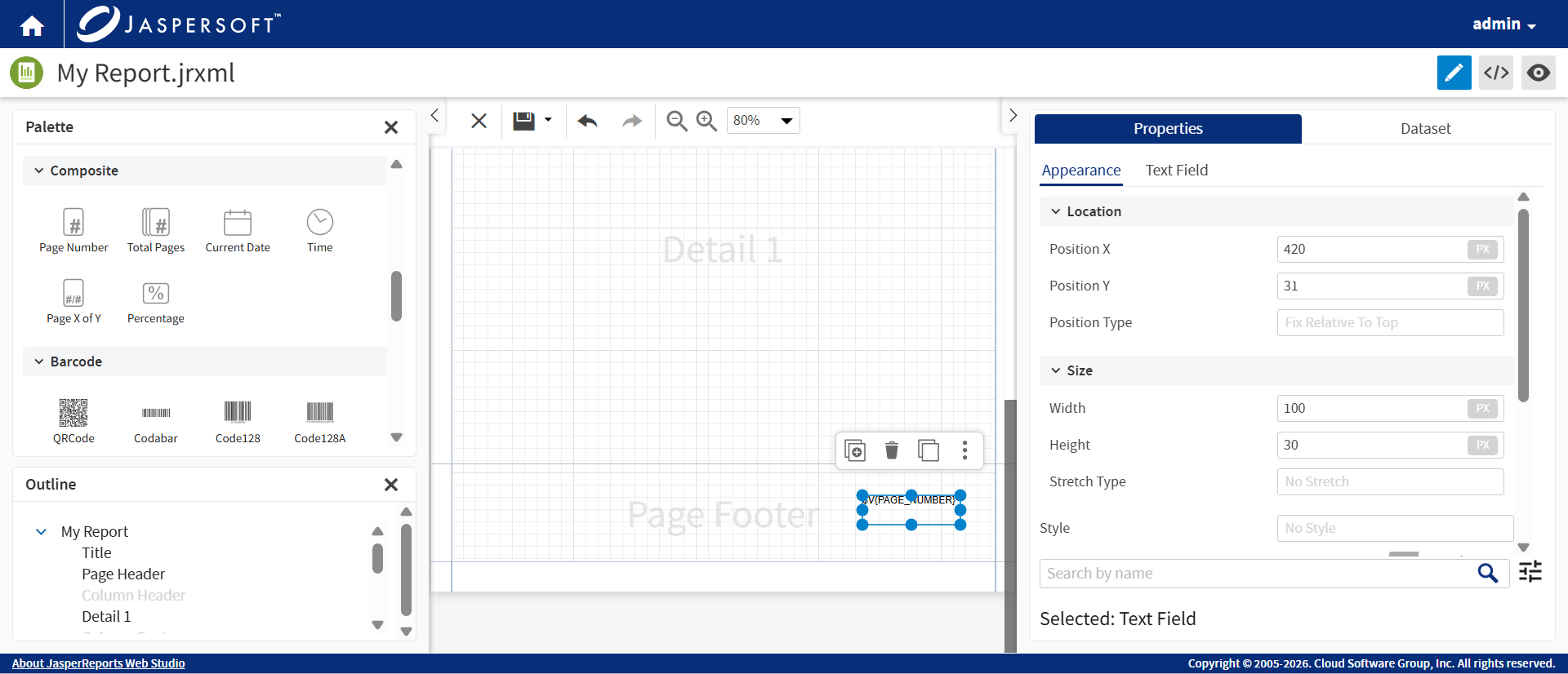
Click the Text Field. The Expression is preconfigured.
The page number appears in the correct format on every page during preview.
Tables
To create tables in a report, drag the Table element from the Palette to the desired location on the report page.
In the Table Wizard, you can see the Open Dataset Tab only if there are no sub dataset defined in the report. The table element must have a sub dataset to work correctly. You have to create a sub dataset to have a table in the report, click Open Datasets Tab to navigate to the Dataset tab. Click Cancel to cancel the process.
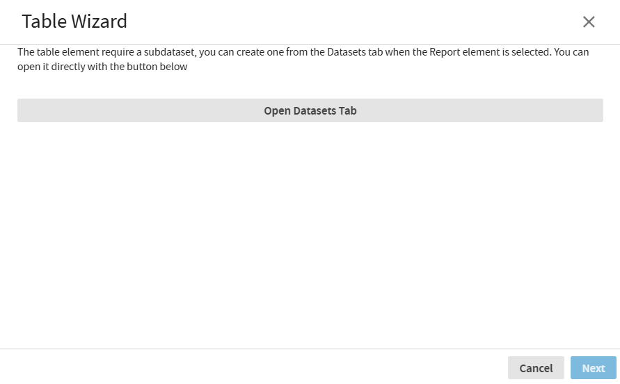
In the Dataset tab, select an existing one or define a new dataset and ensure that the data adapter for the created dataset is correctly browsed and configured.
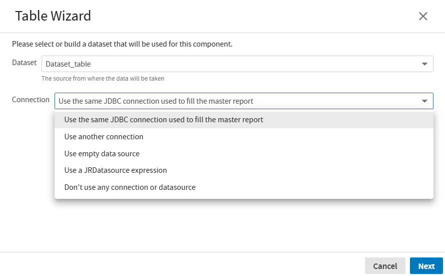
Now you drag and drop Table component from Palette to summary band. In the Table Wizard, select the dataset from the Dataset dropdown.
Select the Connection from the dropdown, for how the table should connect to the datasource.
Click Next, to navigate to the next step, or click Cancel to close the dialog.
In the next tab, select the fields of the dataset that can be used to produce the tables column. Click > to transfer one or more fields from the left side to the right. Click < to move one or more fields from right to left side.
To move all the fields from left side to the right, click >> or click << to move fields from right to left side.
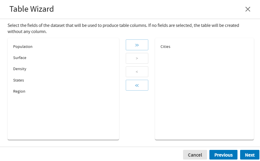
Click Next, or click Previous, to navigate to the previous screens.
The Table Wizard now displays the sample of the table. The Cell Colors, Borders and Visible Sections can be adjusted accordingly.
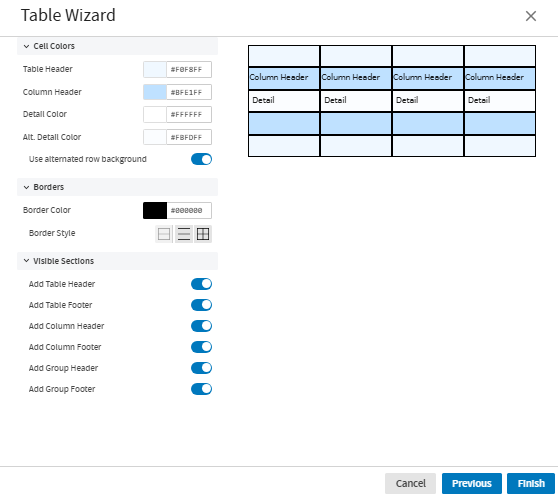
Click Finish, to generate the Table. Now you can preview the table.
You can also edit the existing table. Double-click the table to open the table editor.
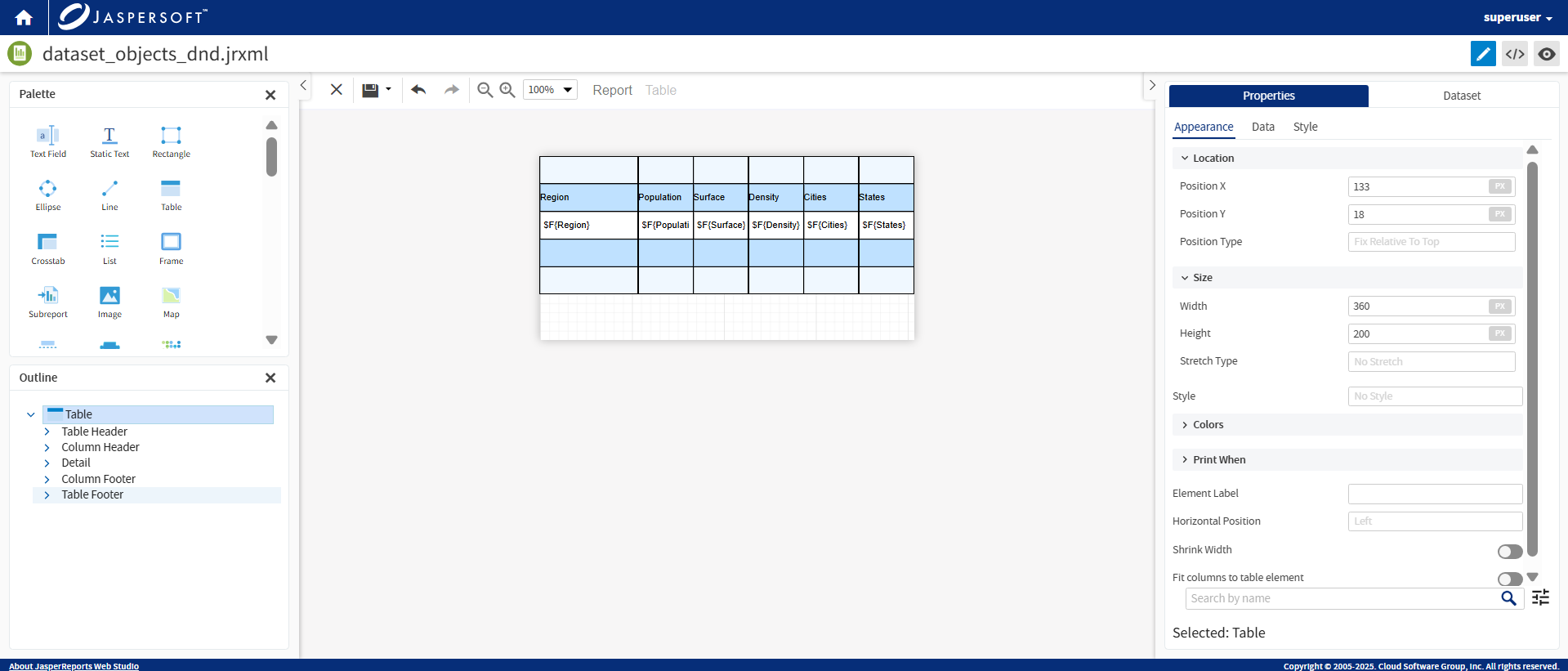
Drag a cell to resize it.
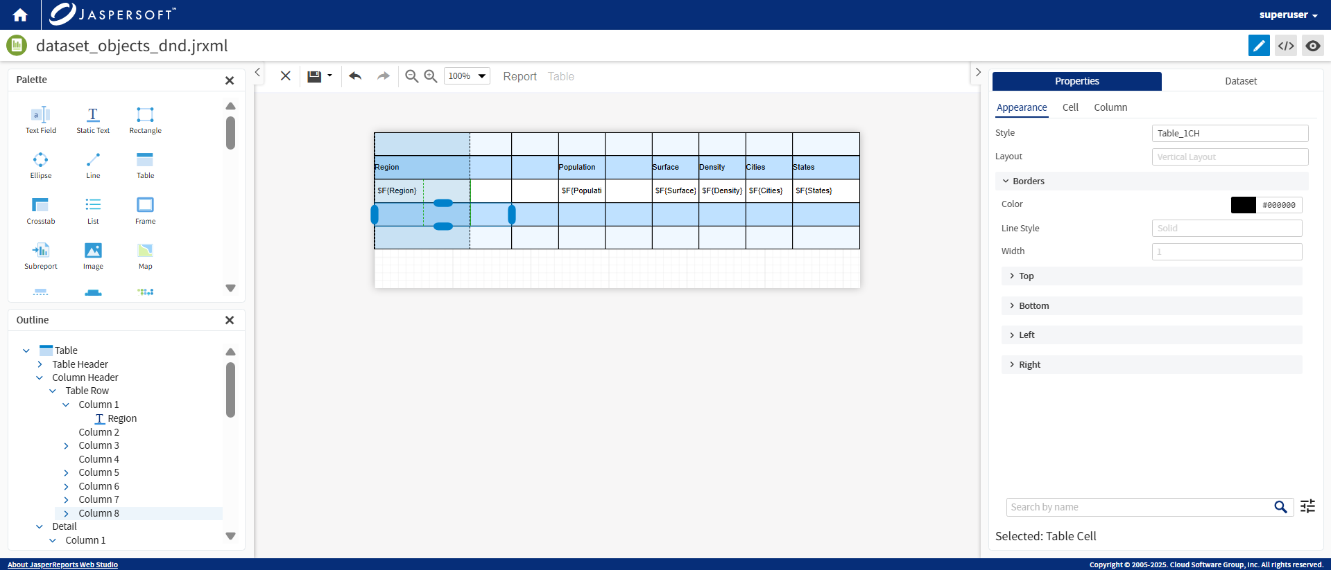
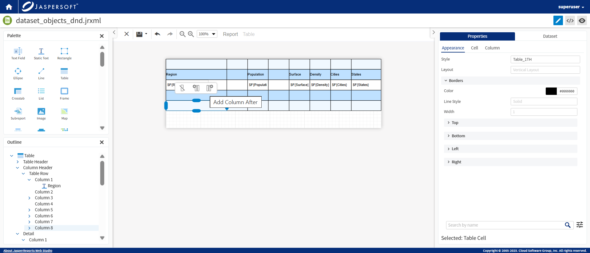
Add and delete columns in the table editor using either the context menu or the mini toolbar.
Drag the fields to the table columns to add data to the table.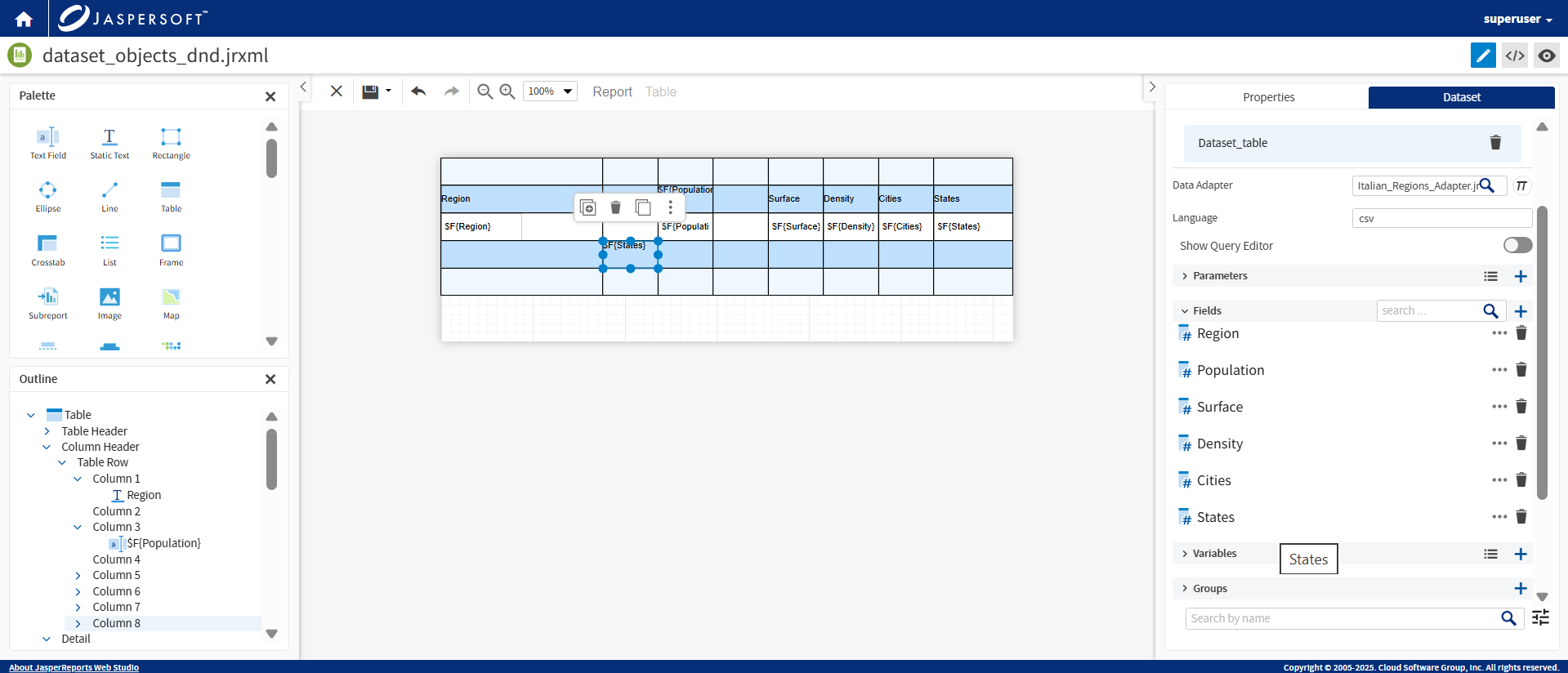
Save the report and preview the data from the Report view.
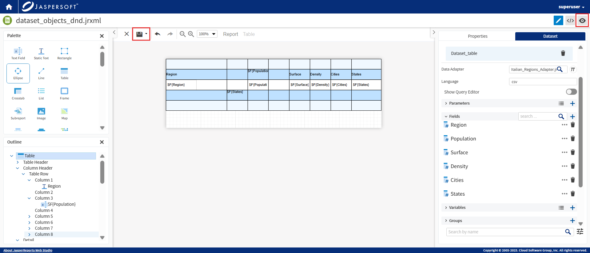
To add a column header, drag one of the fields to the header row. You can also convert the field value to static text.
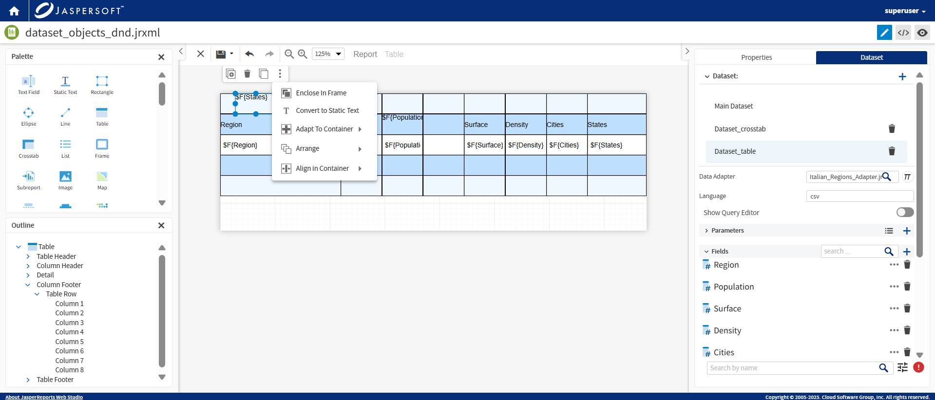
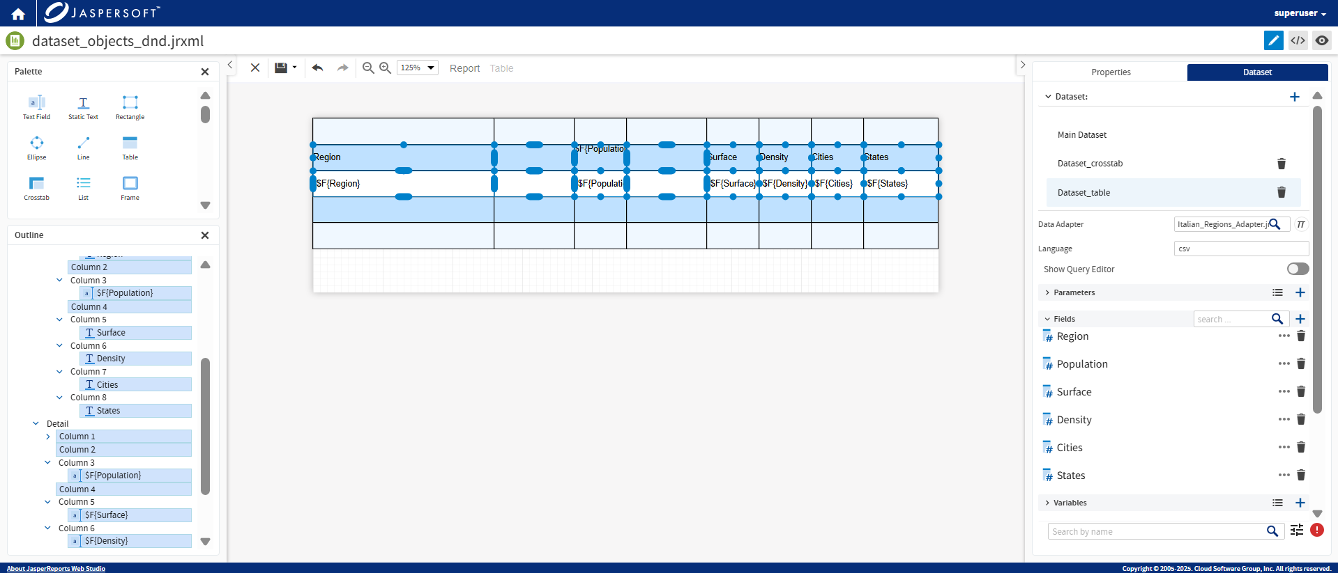
Select elements independently using the Shift key.
In this example, the first and second rows are selected. You can view the details in the Outline pane.
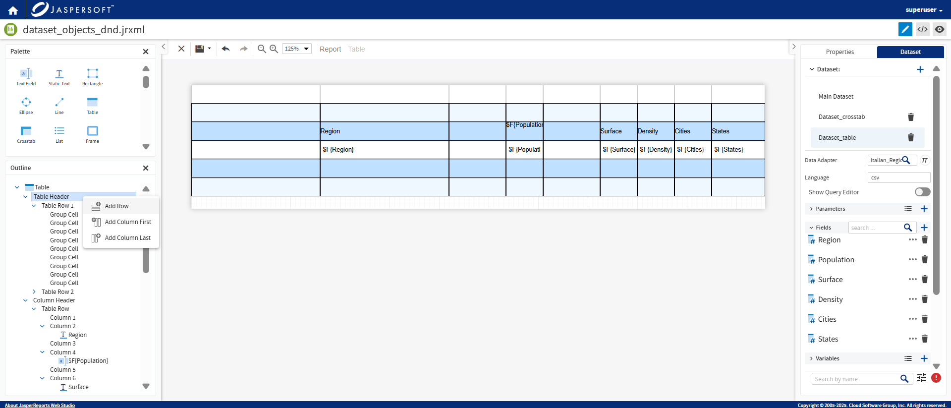
To add a row, go to Outline, right-click Table Header, and from the context menu, click Add Row.
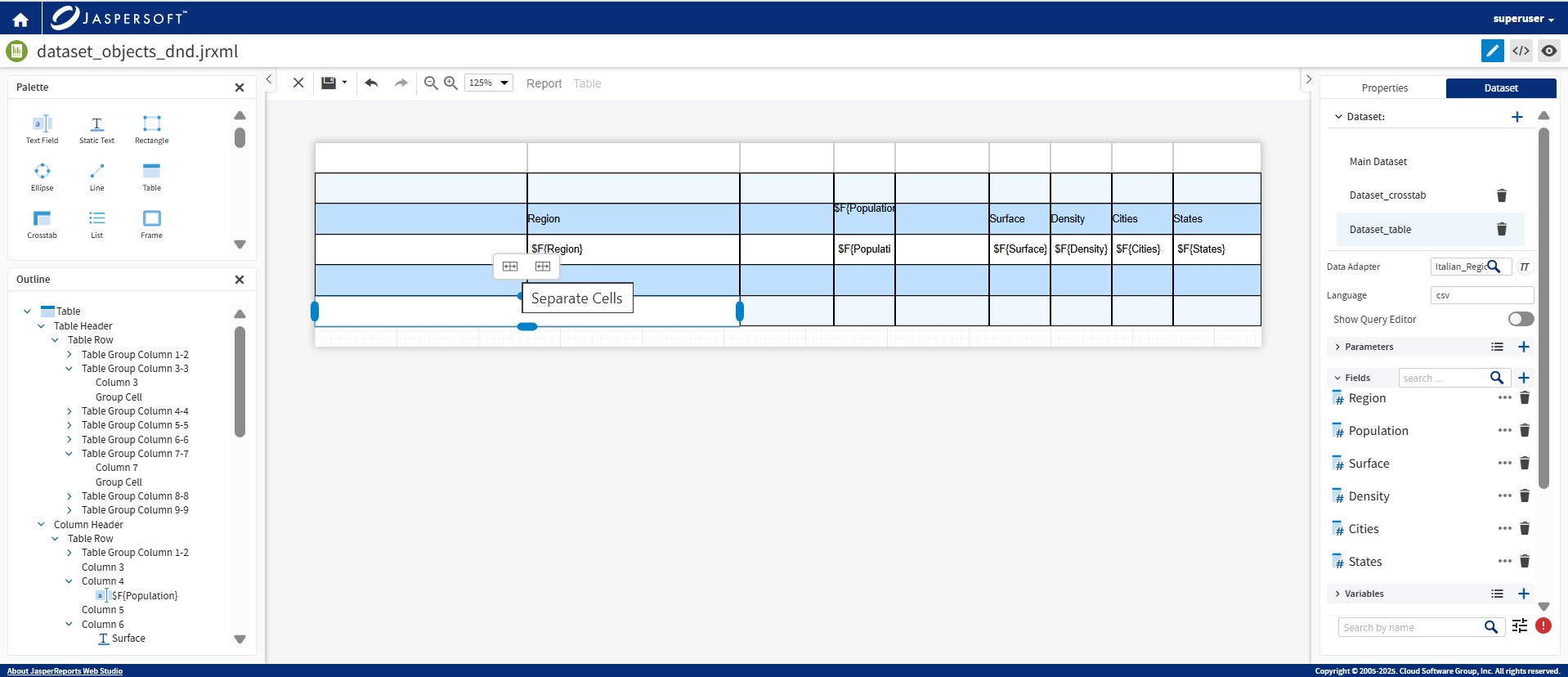
Select two or more cells to Merge Cells.
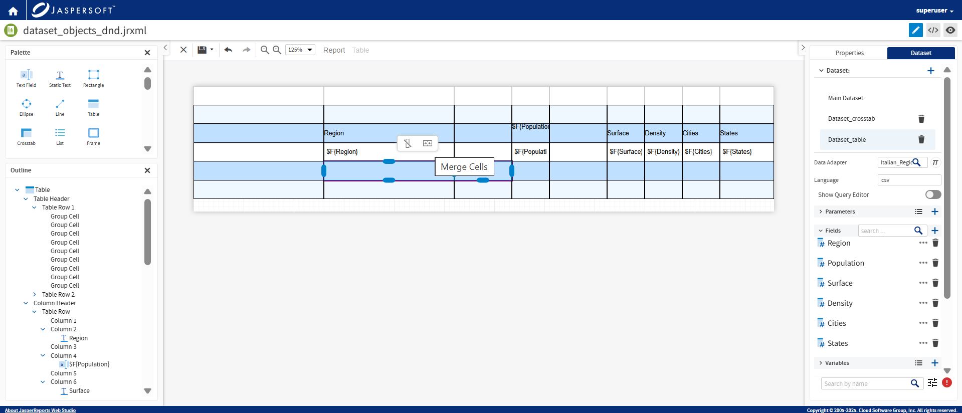
You can Separate Cells too.
Add or Delete Sections
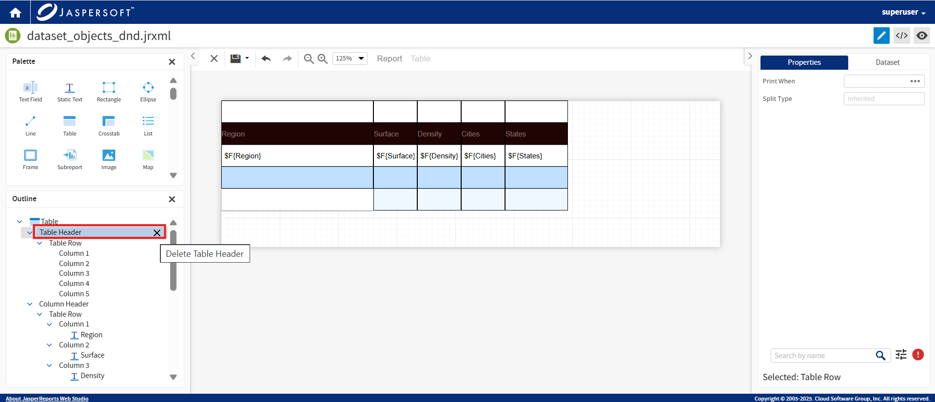
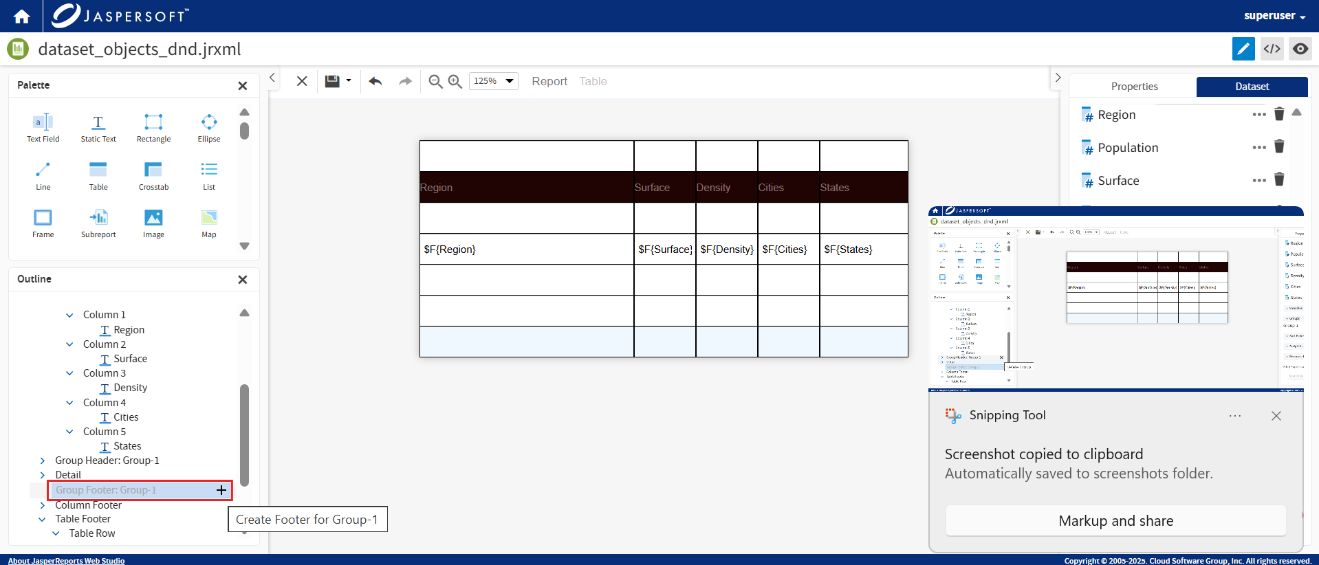
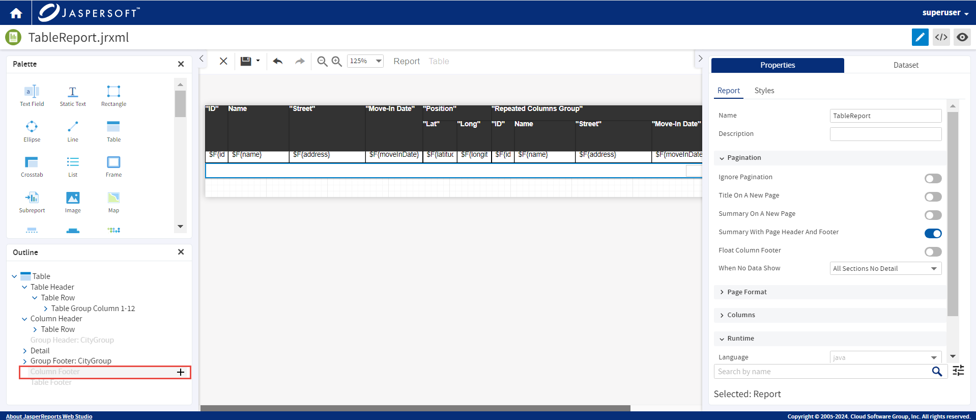
In Outline, when you hover any section of the table, except the Detail, a  is shown on the right. If you click , the section is deleted.
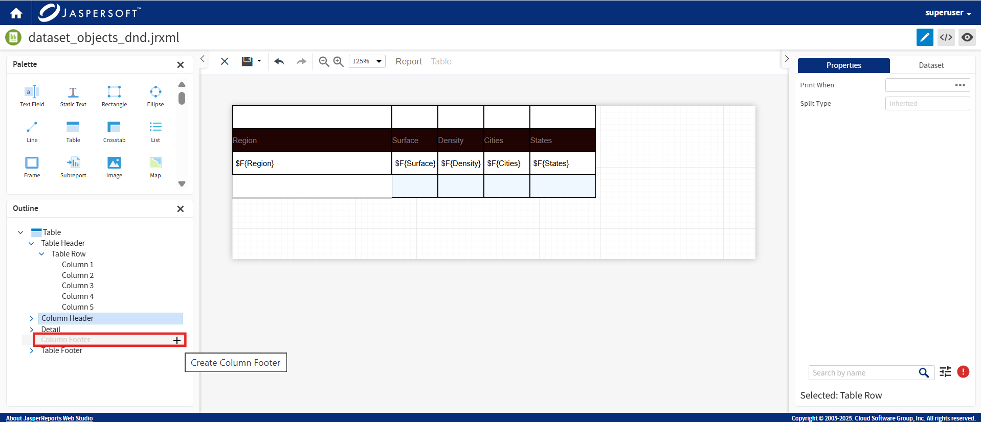
Similarly, if a section is not available, it is displayed in light gray with a + icon next to it. You can click the icon to add the section.
If the dataset connected to the table contains groups, the names of the groups are displayed as additional sections in the Outline of the table.
Click to delete the group.
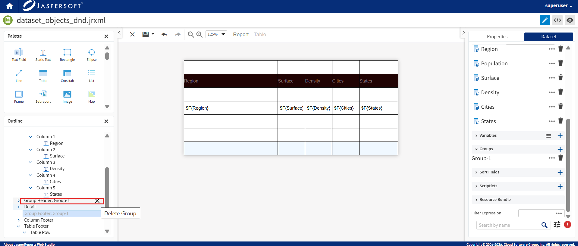
Click + to create the group.
Support for Columns
Create tables with multiple columns using this feature. Go to the Properties panel and add the required Number Of Columns. The Designing Area is evenly divided into columns specified in the Properties panel. The area other than the first column is grayed out. The grayed out area represents where columns continue once information is populated.
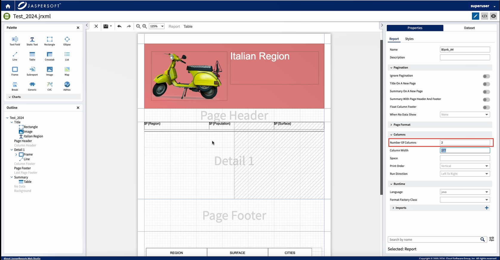
You can resize and adjust the elements to fit the column space.
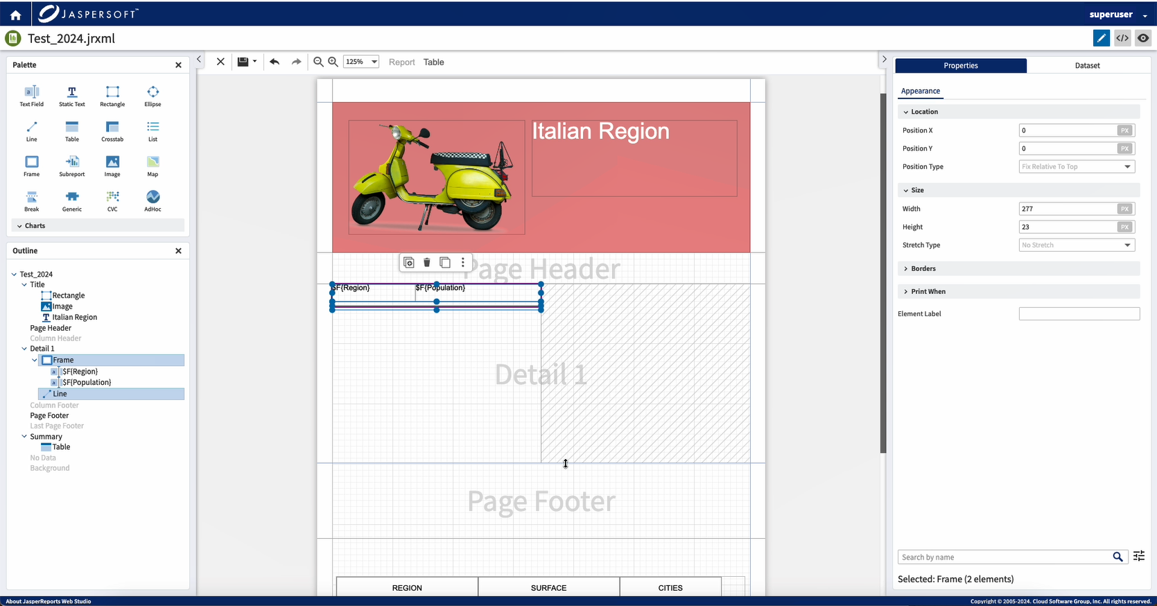
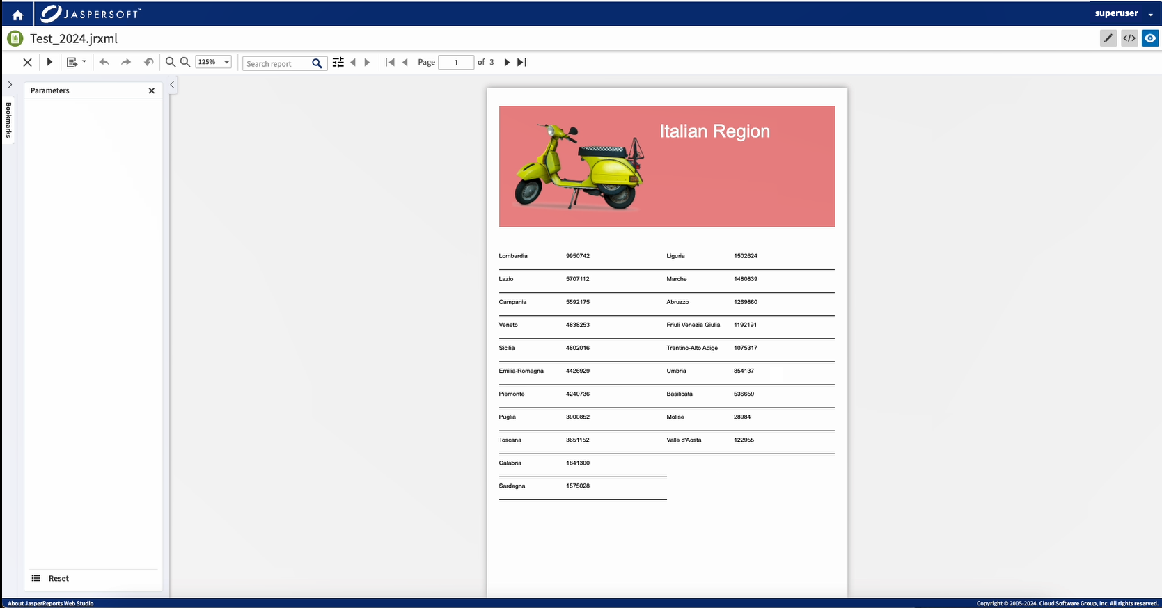
Preview the data. The data is displayed in two-column spaces.
For example, in the following screenshot, the data populated the next two columns once the first two were used.
Crosstab
This feature enables you to add a crosstab to the report with ease. Drag the Crosstab element from the Palette to the Summary section on the report page.
-
In the Crosstab Wizard, select the dataset from the Dataset dropdown.
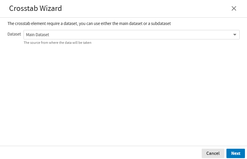
Click Next, to go to the next screen or click Cancel, to cancel the operation
-
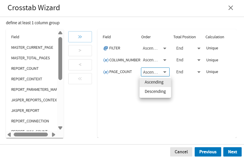
In the next tab, to define at least one-column group, select one or more fields and click > to transfer one or more fields from the left side to the right. You can also move one or more fields from the right side to the left.
To move all the fields from left side to the right, Click >>.
Click Next to add the row group fields, or click Previous to navigate to the previous screen.
-
In the next tab, to define at least one-row group, select one or more fields and click < to move one or more fields from left to the right side.
To move all the fields from right side to the left, click <<.
Once you select a field for a column or a row group, the following options are available on the right-hand side:
-
Field: Displays the name of the field.
-
Order: Enables you to choose the option to display the details in order. You can select, Ascending, or Descending from the dropdown menu.
-
Total Position: None, Start, End.
-
Calculation: None, Count, Sum, Average, Lowest, Highest, Standard Deviation, Variance, System, First, Distinct Count.
Click Next.
-
Note
If a field is already selected in the column group, you cannot view the same field in the row group.
-
To define at least one measure, select one or more fields and click > to move one or more fields from the left side to the right. You can also move one or more fields from the right side to the left.
Click Next.
-
The Crosstab Wizard now displays a sample of the Crosstab. The Cell Colors and Borders can be adjusted. You can use the Show Grid toggle to control the display of the borders in the crosstab.
You can change the colors by clicking the color box next to the Total Color, Group Color, Measure Color, Detail Color and Border Color respectively. The color changes dynamically.
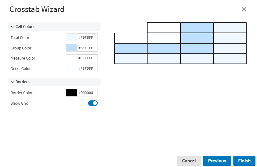
Click Finish, to generate the crosstab.
The Crosstab is created on the Summary band of the report.
Now you can Preview the report. Scroll up and down the page and navigate to any page you want.
Calculation Configuration Wizard
When you drag a field into a band other than the Detail band, such as a Header, Footer, or Summary, the system automatically recognizes that an aggregation is likely needed.
The Calculation Configuration Wizard appears asking you to choose a calculation type. The calculation types include, No Calculation Function, Count, and Distinct Count.
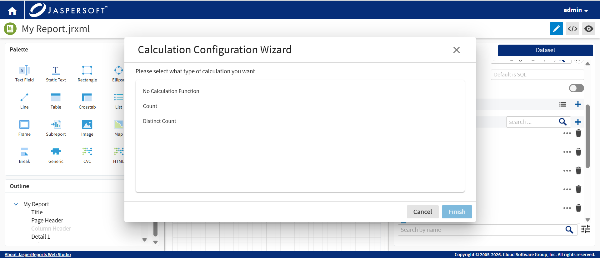
If the field is numeric, you see an expanded list of mathematical calculation options.
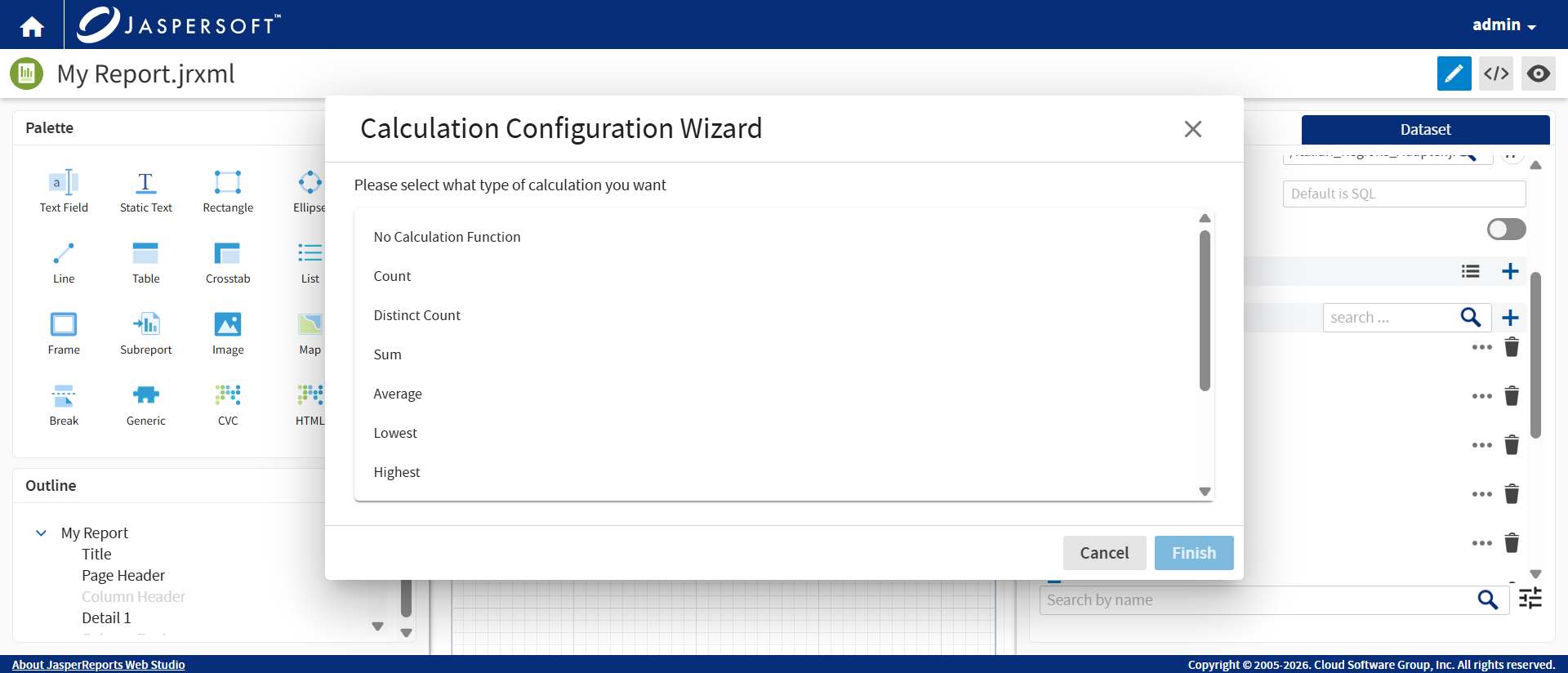
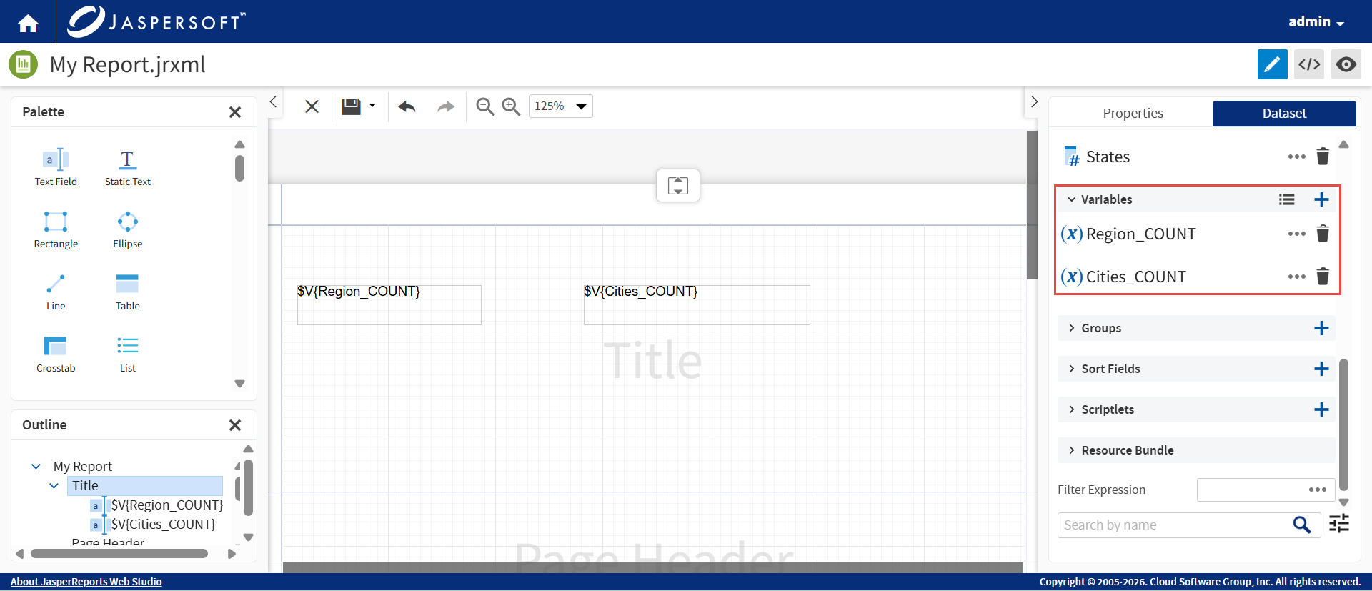
Once you make a selection, the system automatically creates all the necessary variables and expressions required to resolve the calculation, saving you from manual configuration.
Dataset
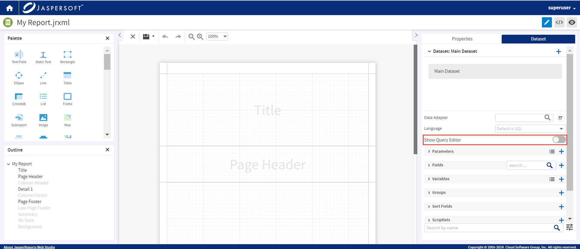
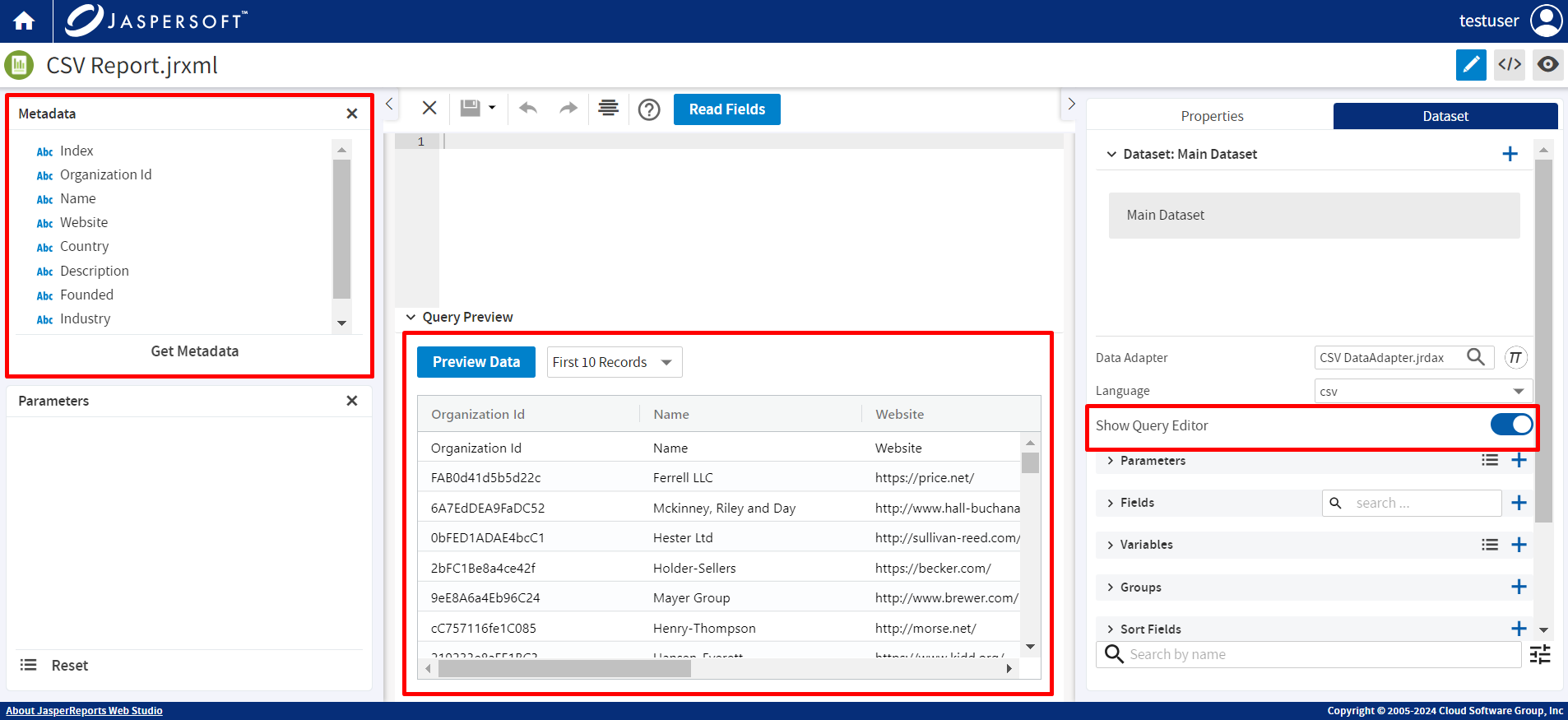
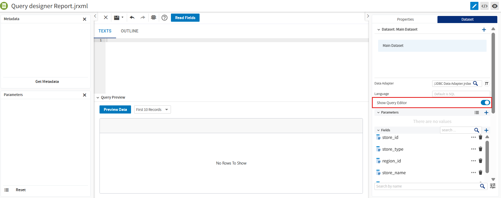
You can go to the Dataset panel to configure the report datasets from the list. Each dataset in the Properties panel has Fields, Parameters, Variables, Groups, and a list of other properties. Use Show Query Editor to show the query editor and all related tools.
The Metadata panel helps visualize the structure of most of the JDBC databases or CSV, XLS, XML, and JSON files. You can drag nodes from the Metadata panel into the query editor area, streamlining the query creation process and reducing manual typing.
To ensure a fast and responsive experience when working with large databases, the Metadata panel uses "on-demand" loading. Instead of waiting for the entire schema to load at once, the system retrieves information only when you click to expand a specific folder or table. This prevents connection timeouts and allows you to begin building queries immediately, even with massive data structures.
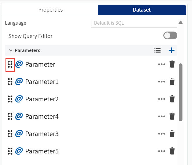
The Parameters panel is for setting the values for the parameters. You can drag-and-drop parameters to reorder them. Use the icon to the left of each parameter name to manage their sort order and ensure correct dependencies.
In the query editor area, depending on the language, a text editor with syntax highlighting helps edit the query. Query Preview is useful to run the query and see what data it returns.
Drag and Drop Fields
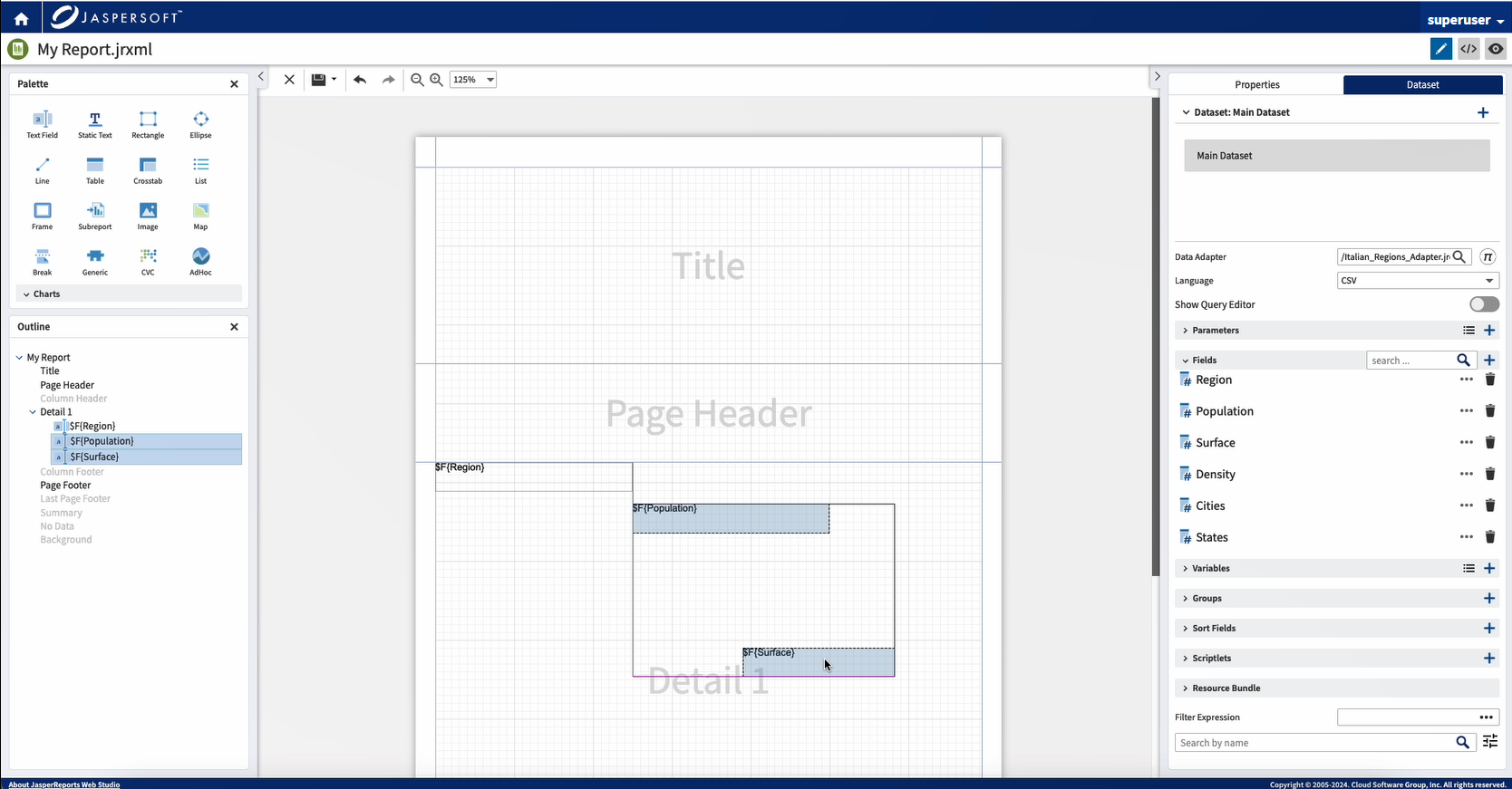
To simplify report creation, drag the fields from the Dataset panel into the report design. The designer creates a Text Field with the corresponding expression automatically.
Configuring Text Field Pattern
You can easily format how numeric and date-time data appears in your report using the Pattern property.
To configure the pattern:
-
Select a Text Field in your report.
-
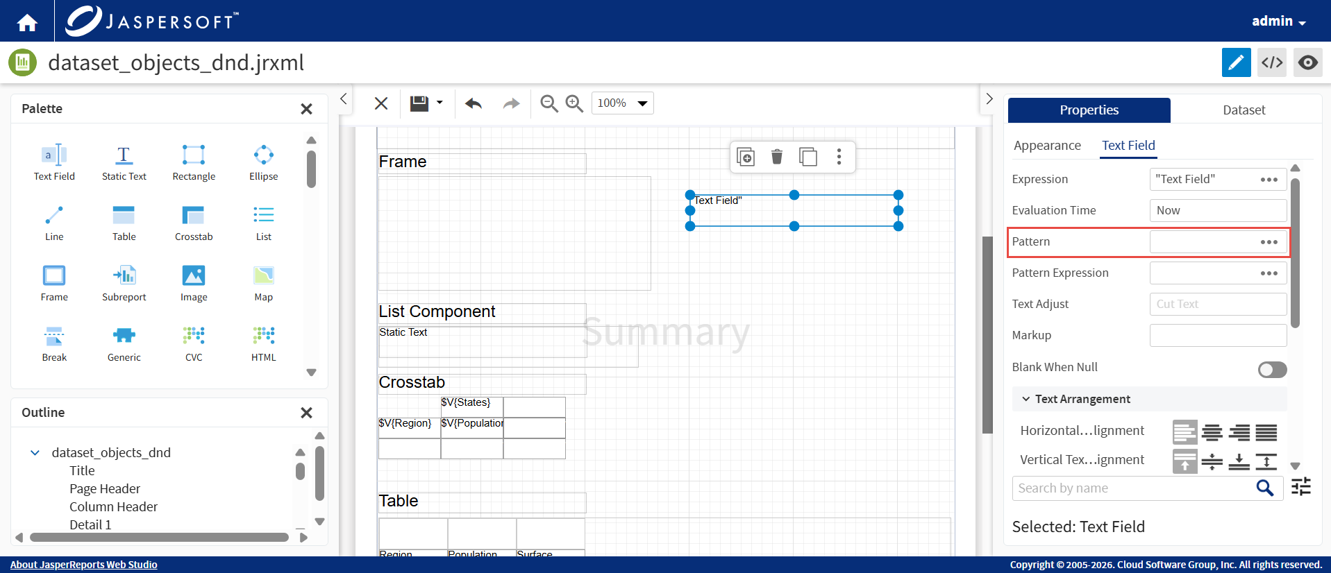
In the Properties panel, select Text Field and locate the Pattern field.
-
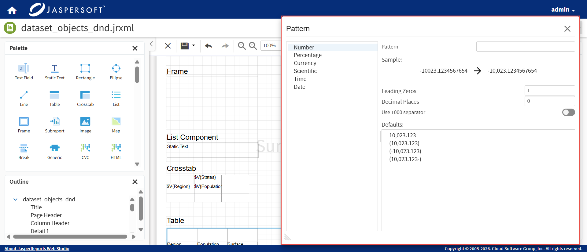
Click the ellipsis to open the Pattern selection dialog.
-
Choose from a library of predefined and commonly used formats.
-
Use the adjustment controls at the bottom of the dialog to fine-tune the pattern to your specific requirements.
Validation and Refactoring
Dataset objects are used as references by all kinds of elements inside the report. There is a validator of the model. In case there are problems, a red icon appears at the lower-right corner. Click the icon to see the problems.
In case dataset, fields, parameters, and variables are either renamed or deleted, the designer tries to refactor expressions or other references in the model.
Copy and Paste Elements
To copy and paste elements in the report layout designer, you can use any one of the following options:
- Select the component and use the standard browser shortcut keys (Ctrl+C and Ctrl+V) from the keyboard.
OR
- Right-click on the component and from the context menu, select Copy and then Paste.
Expression Editor
The Expression editor is composed from two panes. The left-hand side pane lists the dataset objects that you can use in the expression. The right-hand side panel shows the expression itself.
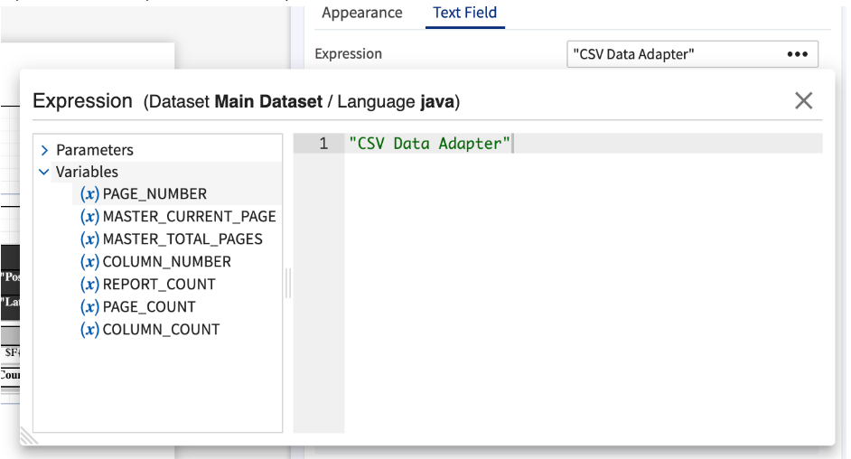
You can replace a selected text with an expression. To do this, edit the expression using the Expression editor, and select the text in the expression text area. On double-clicking the field, the selected text is replaced with the expression of the field. You can drag the elements from the left panel to the text area.
Query Designer
The Query Designer provides a visual interface for creating and modifying queries for datasets. It supports both manual query editing and visual query construction using drag-and-drop functionality.
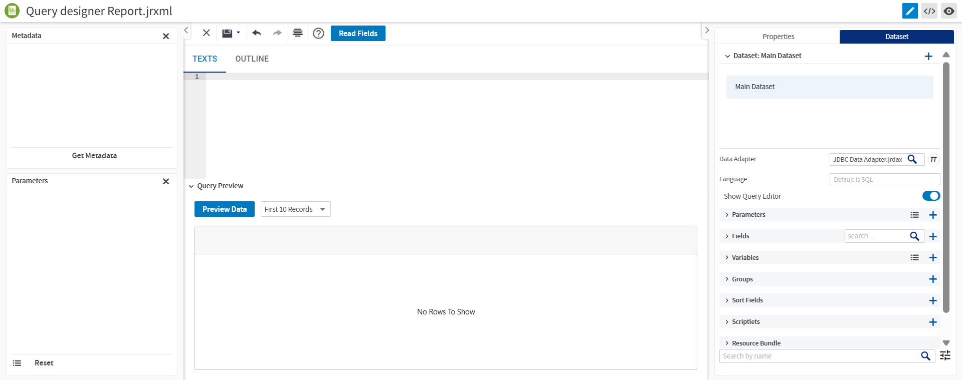
Accessing the Query Designer
To access the Query Designer:
-
Log into JasperReports Web Studio.
-
Create a report or open an existing report.
-
Navigate to the Dataset section.
-
Configure or select a valid data adapter.
-
In the Dataset panel, enable the Show Query Editor toggle.
Query Editor Views
The Query Designer provides the following two views:
-
Text view: Enables direct editing of SQL queries with syntax highlighting.
-
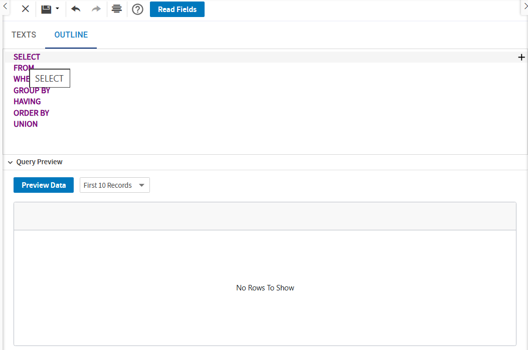
Outline view: Displays query components such as SELECT, FROM, WHERE, GROUP BY, and ORDER BY in a structured format.
The changes made in any one view are automatically updated in the other view.
Metadata Support
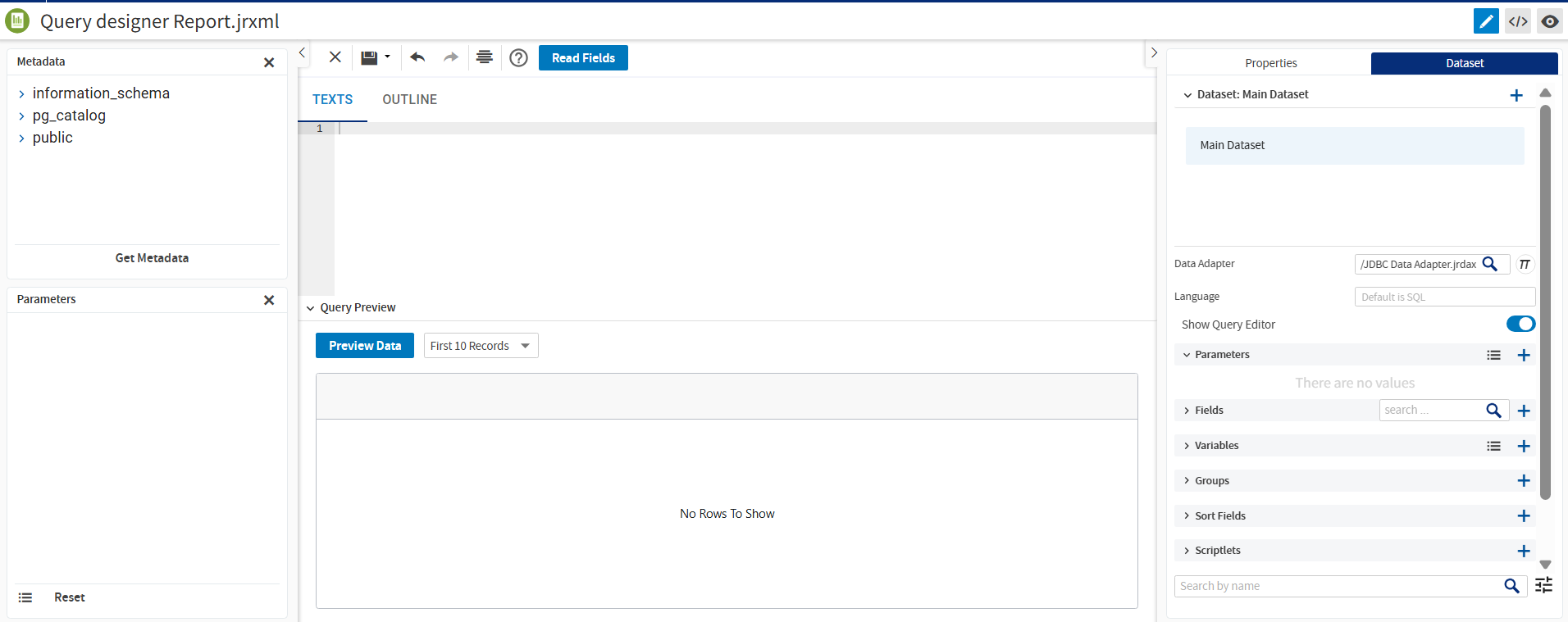
The Metadata panel displays the structure of the configured data source.
To load available tables and columns:
-
Click Get Metadata.
-
Expand the nodes to view the fields.
-
Drag tables and columns directly into the query editor.
If the configured data adapter is not valid, an error message is shown when you attempt to load metadata.
Creating Queries
You can create queries either by using drag-and-drop operations or by manually editing SQL.
-
Drag columns into the SELECT clause.
-
Drag tables into the FROM clause.
-
Add sorting fields to ORDER BY.
-
Drag fields from the Metadata panel.
-
Drag parameters from the Parameters panel.
The query structure is updated automatically.
Working with Conditions
To add conditions:
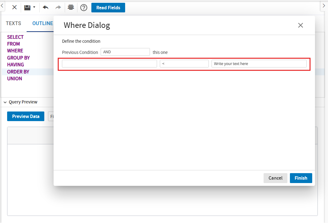
- Right-click the WHERE clause.
- Click Add Expression.
- In the Where Dialog, define the specific field, operator, and associated value.
- Click Finish.
Conditions support logical operators, such as AND and OR. The same is applicable for supported clauses, such as HAVING.
Expressions and Subqueries
The Expression editor allows you to add custom expressions to the SELECT, FROM, and WHERE clauses. To add custom expressions:
-
Drag fields into expressions and combine fields, constants, and operators.
-
Add subqueries by configuring nested queries using the Subquery option in the editor.
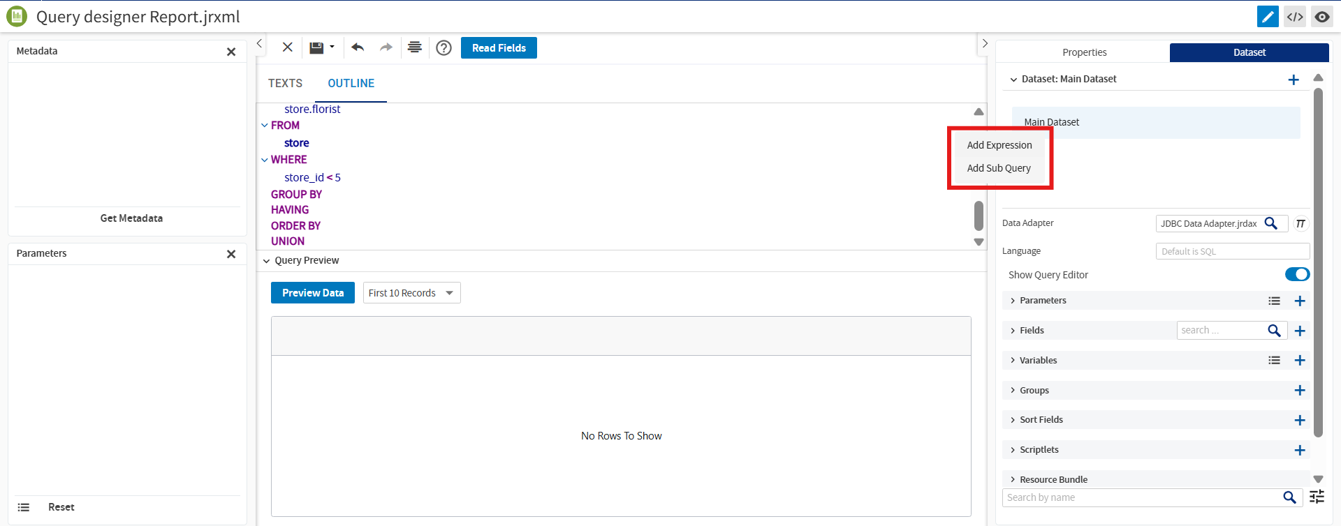
The changes automatically are reflected in both the Text and Outline views.
Query Validation and Preview
Click Preview Data to run the query and view the results.
The system displays validation messages for the following errors:
-
Empty queries
-
Invalid SQL syntax
-
Invalid columns or expressions
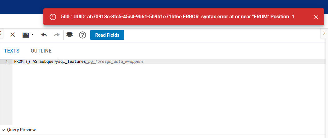
If a validation error occurs, the query remains intact while the error message is displayed.
Reordering Query Elements
You can reorder query elements using drag-and-drop operations.
The following elements can be reordered:
-
Fields in SELECT clauses.
-
Conditions in WHERE clauses.
-
Fields in ORDER BY and GROUP BY clauses.
The changes are automatically reflected in the Text View and applied during execution.
Saving Queries
Queries are retained and saved automatically when you close the editor. Previously configured queries are restored on reopening the report.
Additionally, switching between Text View and Outline View does not result in data loss.
JRXML Source Editor
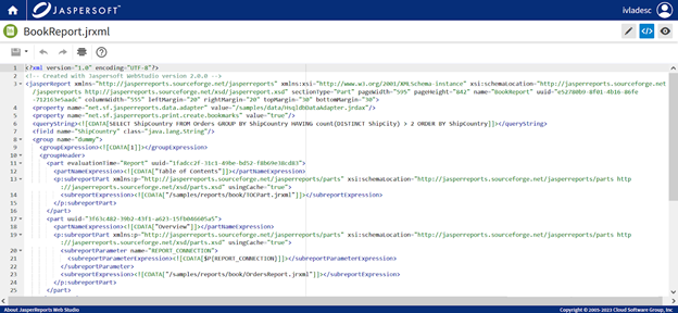
Report templates for JasperReports Web Studio are text files with .jrxml extension. You can use the Source Editor to manually modify a template by editing the XML code.
Report Preview
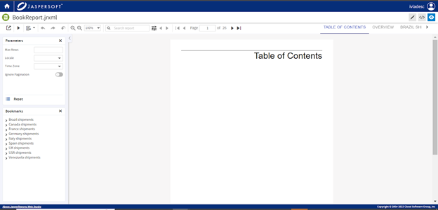
This is the place to consume and test reports. This view provides user interfaces to give values to parameters, select the format to generate, and navigate the report. Report navigation could be done in different ways. On the top toolbar, there are controls to select the desired page, search through the report, or use bookmarks to navigate in the report. The bookmarks are present on the left side of the page, with toolbar buttons being linked only to sub-reports that are referred to by the main report.
When a report is previewed, it is executed at the backend by JasperReports® IO. JasperReports IO is an HTTP-based reporting service for JasperReports® Library, providing an interface to the JasperReports Library reporting engine through the use of a REST API and a JavaScript API. The REST API provides services for running, exporting, and interacting with reports. The JavaScript API allows you to embed reports and their input controls into your web pages and web applications using JavaScript frameworks for the layout and style sheets (CSS) to control the look and feel. JasperReports IO provides multiple configurable options, including the ability to limit execution of certain report expressions for security reasons.
Following is the list of security-related configuration changes:
-
Enabling the Java Security Manager:
In the Professional edition, the Java Security Manager can be enabled by uncommenting the following lines in:
-
start.shscript:#JRWS_SECURITY_ARGS="-Djava.security.manager -Djava.security.policy=${ROOT_PATH}/jrws/security.policyOR
-
start.batscript:#rem set "JRWS_SECURITY_ARGS=-Djava.security.manager -Djava.security.policy=%~dp0\jrws\security.policy
In the Enterprise edition, set the
javaSecurityEnabledHelm chart values flag totrue. -
-
Report expression class filtering
To enable report expression class filtering in the Standalone edition, set
net.sf.jasperreports.report.class.filter.enabled=truein theapplicationContext-common.xmlfile.In the Enterprise edition, set the
reportExpressionsClassFilterEnabledHelm chart flag totrue.More classes can be allowed in report expression by setting
net.sf.jasperreports.report.class.whitelist.* propertiesinapplicationContext-common.xmlor via thejrioReporting.config.jasperReportsPropertiesHelm chart values property. -
Repository Jars class loading
In the Standalone edition, to disable loading classes from repository jars, set the
classLoadingEnabledproperty of thejrioContextProviderbean tofalsein theapplicationContext-common.xmlfile.In the Enterprise edition, set the
repositoryClassLoadingEnabledHelm chart values flag tofalse.
Data Adapter Editors
An important aspect of reporting is acquiring the data for the reports. This data usually comes from relational databases, files, or other specialized data storage systems.
The way to acquire report data in JasperReports Web Studio is by using data adapters, which are specialized files containing information about how to get the data.
Data adapters could be of the following types: Random, Empty, QueryExecutor, relational database connections (JDBC), MongoDB, Mondrian, locally stored or remotely retrieved data files of CSV, XML, JSON, XLS type, and so on.
JasperReports Web Studio features a specialized editor that allows creating and editing these Data Adapter types.
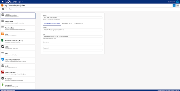
Image Editors
There is basic support for images. By default, JasperReports Web Studio shows an image supported by the browser. For some image types, there is an image editor, which helps to modify an existing image.
Text Editors
Most of the text files are editable with a simple text editor. However, for many types, JasperReports Web Studio supports syntax highlighting and some more advanced editor functions like folding, and validation. This could be very useful for files like properties, CSS, HTML, XML, JSON, SH, SQL. The text editor supports functionalities including search and replace text, pretty formatting. To see all the keyboard shortcuts, click the question mark icon on the toolbar.
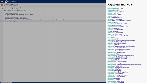
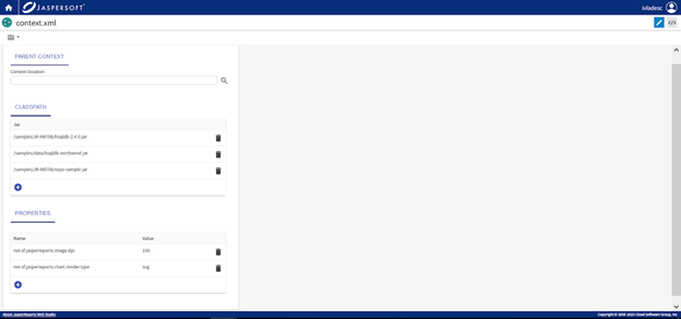
Editor for JR-INF/context.xml
These files provide configuration for report execution. It could contain some properties that are used for reports or classpath. To see a more detailed description of these files, refer to the JasperReports® IO guides.